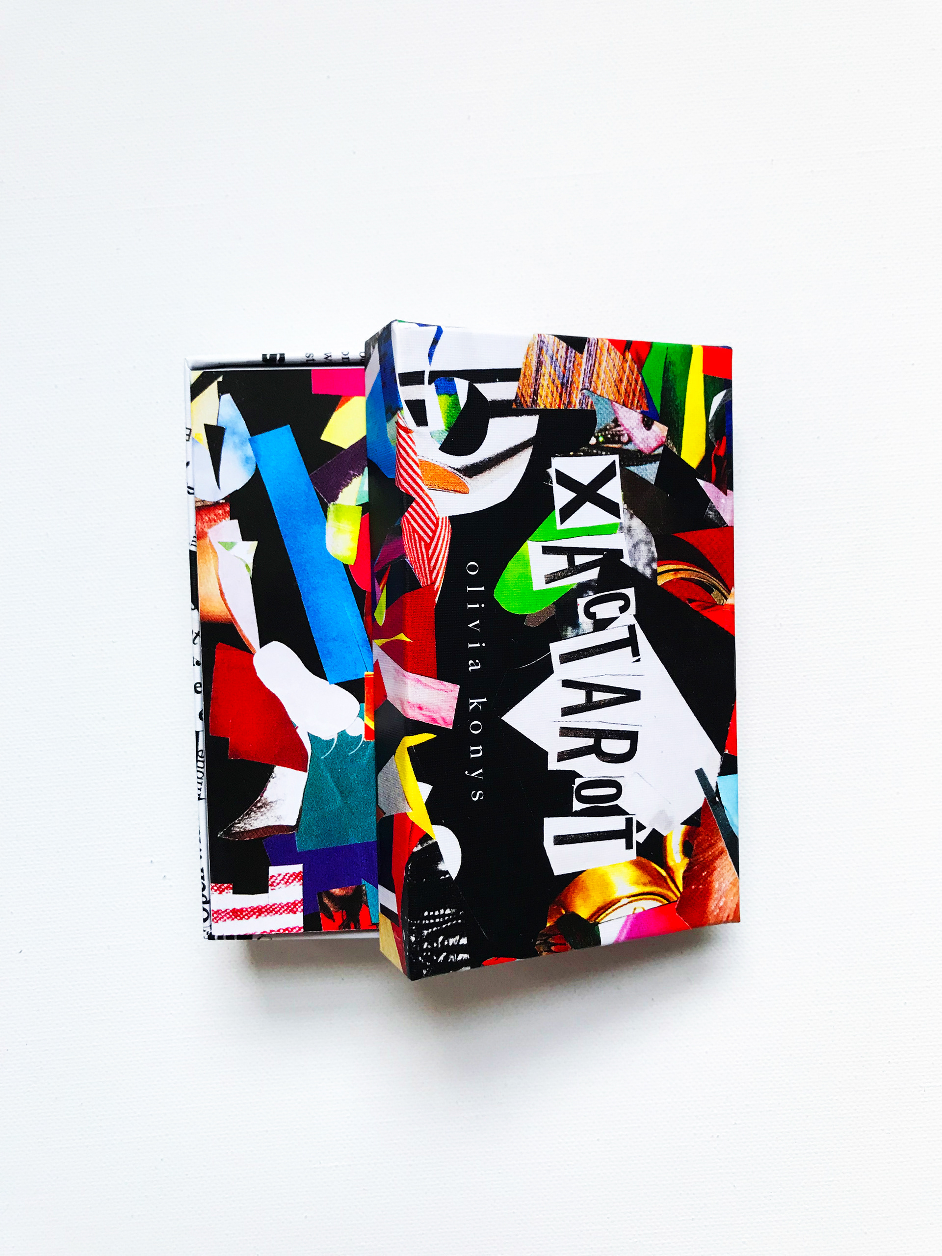
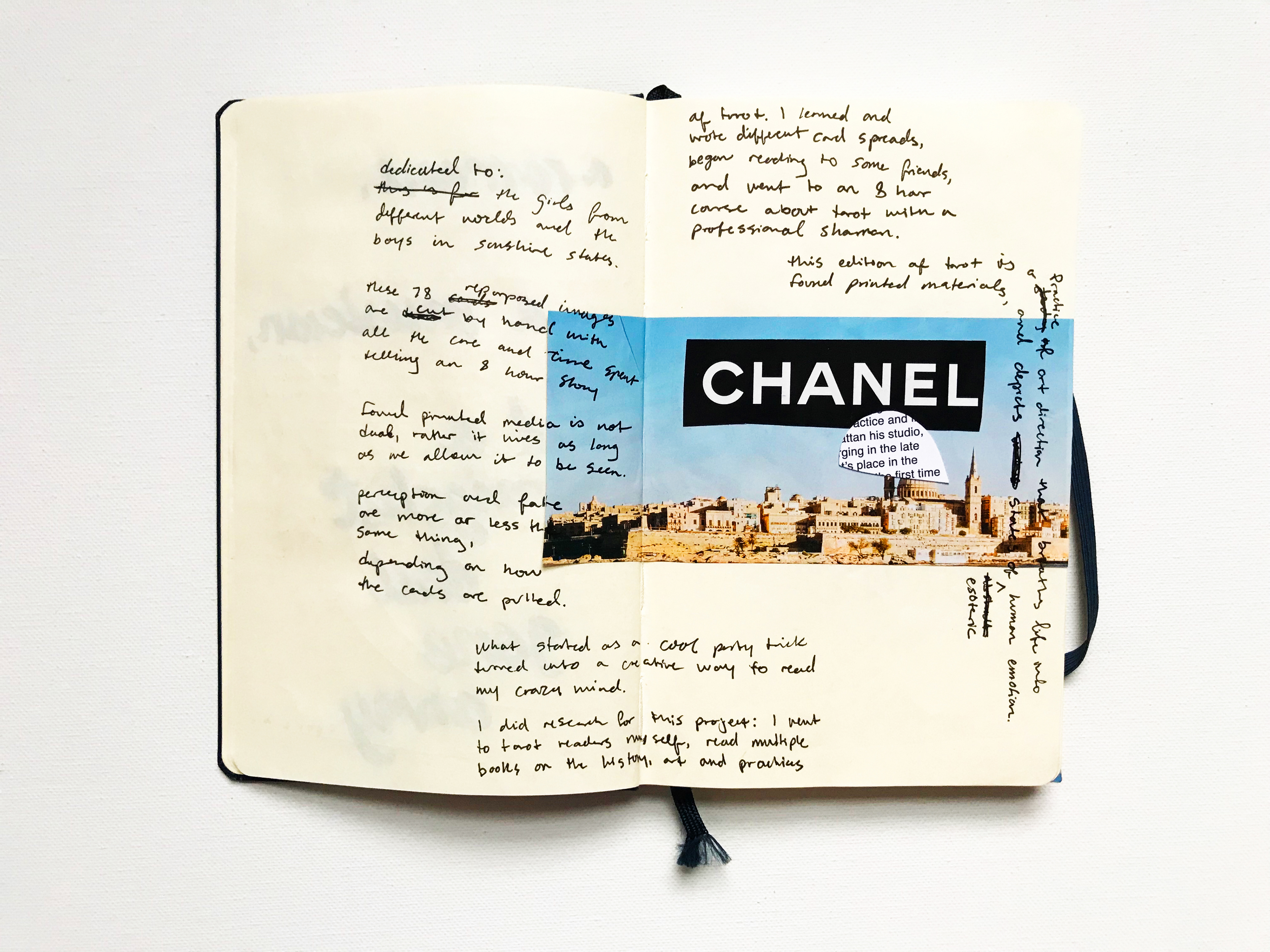
The name "Xactarot" is a play on the blades and scissors used to collage these pieces together by hand. The pieces that caught my eye bring more to my design than I ever could – they live on uniquely in this iteration of the cards – combining and reassigning images and their meanings for multifaceted readings. Collage is an art form viewed as whole, though often dissected in detail. This same approach and energy is very present in the life of an artist and intuitive, learned or be learning.
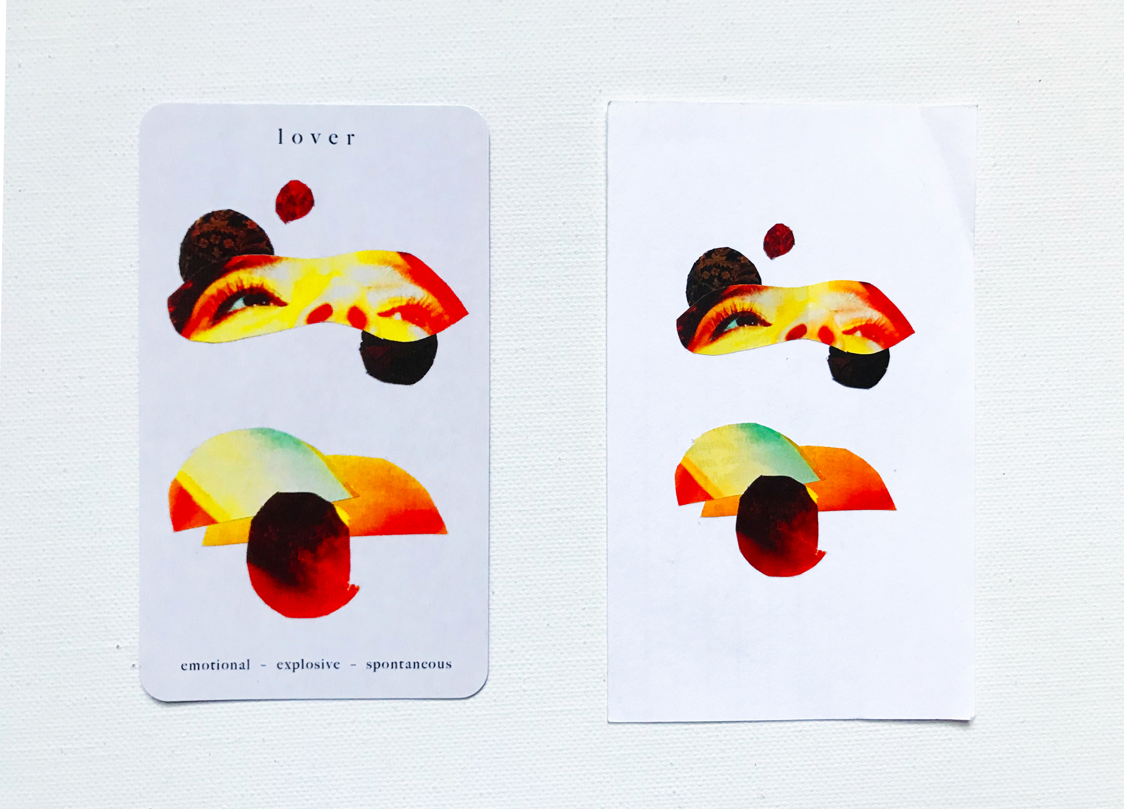
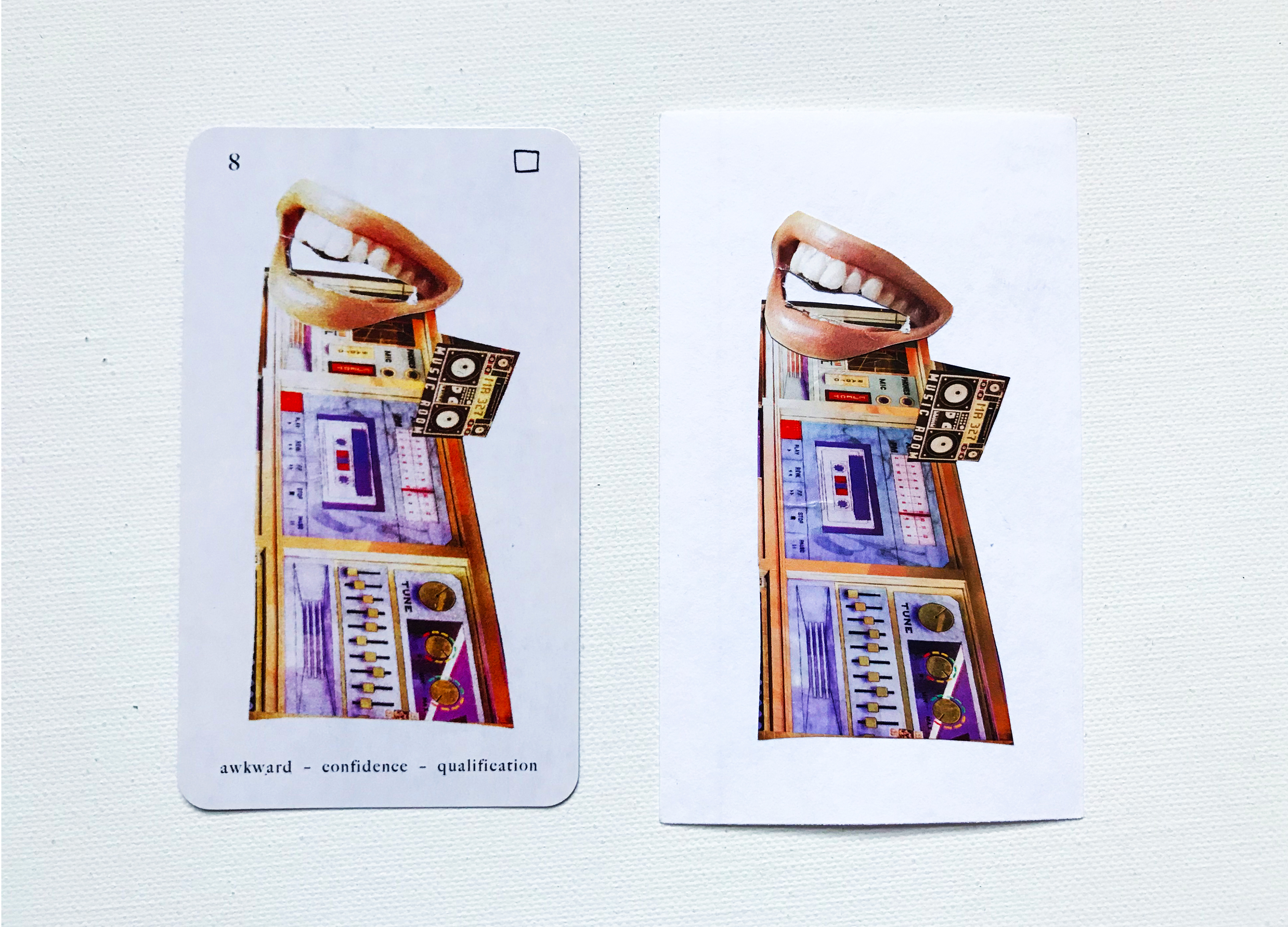
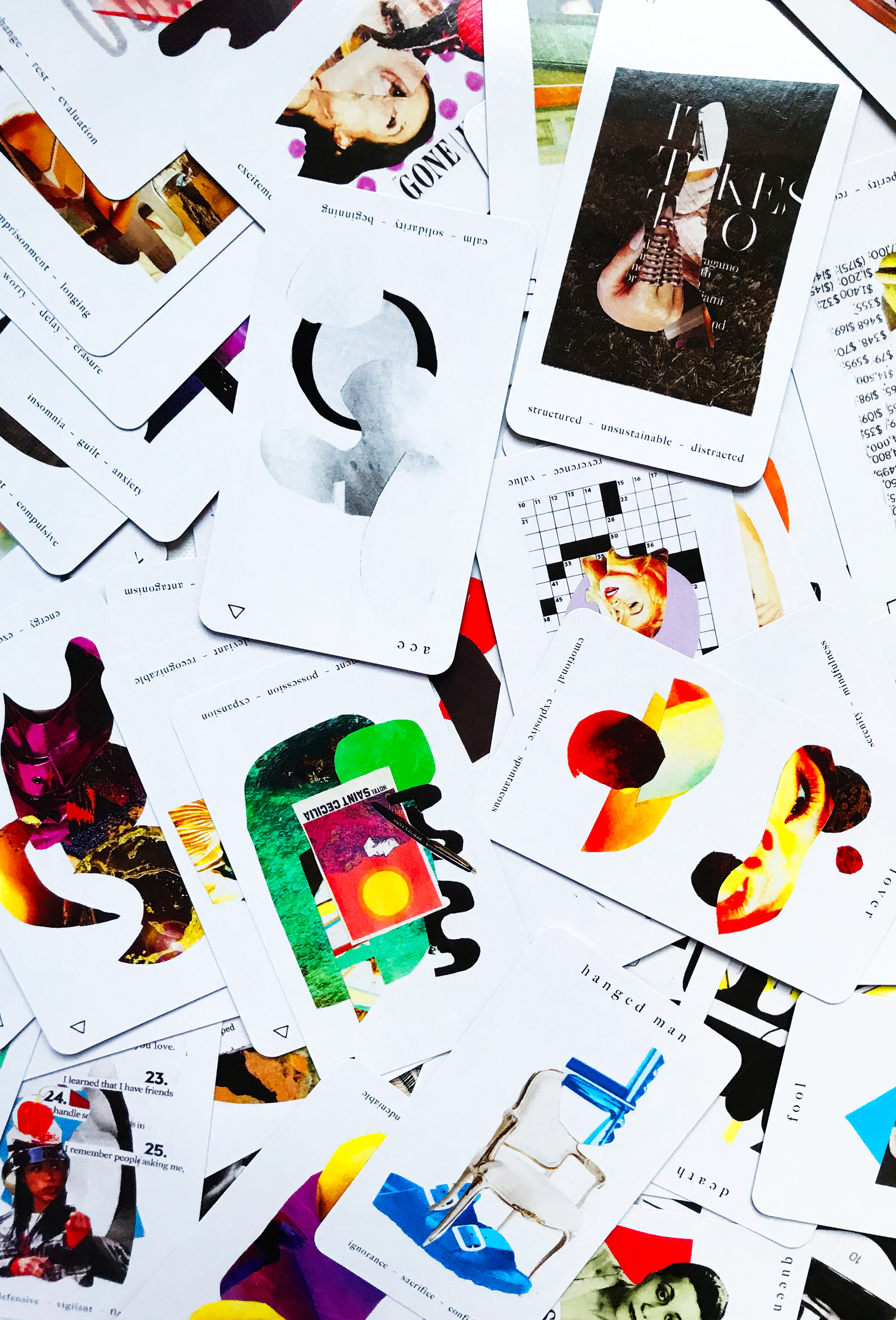
Over the course of a year, and arguably more of a year than any, I confronted these 78 human emotions. These 78 cards communicate through symbols of love, creation, fear and spirit – in forms ranging from the minute to the extreme. A synesthetic and bold style created exclusively from found artworks is paired with revised tarot definitions from my own busy and inescapably creative headspace.
If art direction requires the skill of concepting and creating images to abstract ideas to convey a message, tarot cards' function based in symbology and perception alone presents a very abstract proposal. I made hundreds of collage designs, and selected 78 of the ones that best represented the cards, as well as writing new copy for each card, and diagrams of my own spreads and intentions in a booklet with the set.
In order to learn the fundamentals of tarot, and better understand the medium I was designing for in an educated and respectful way, I researched tarot through a literary approach and in practice. I read through multiple books on tarot about the history and meanings of the cards, listened to podcasts on how intuitives live, learn and rely on this imagery in their lives and practices, took a tarot course with a shaman in Brooklyn, attended a past-life regression workshop, studied numerology, crystology and astrology as it coincides with tarot cards, purchased and studied other artists' decks, and began to learn to pull cards for myself.
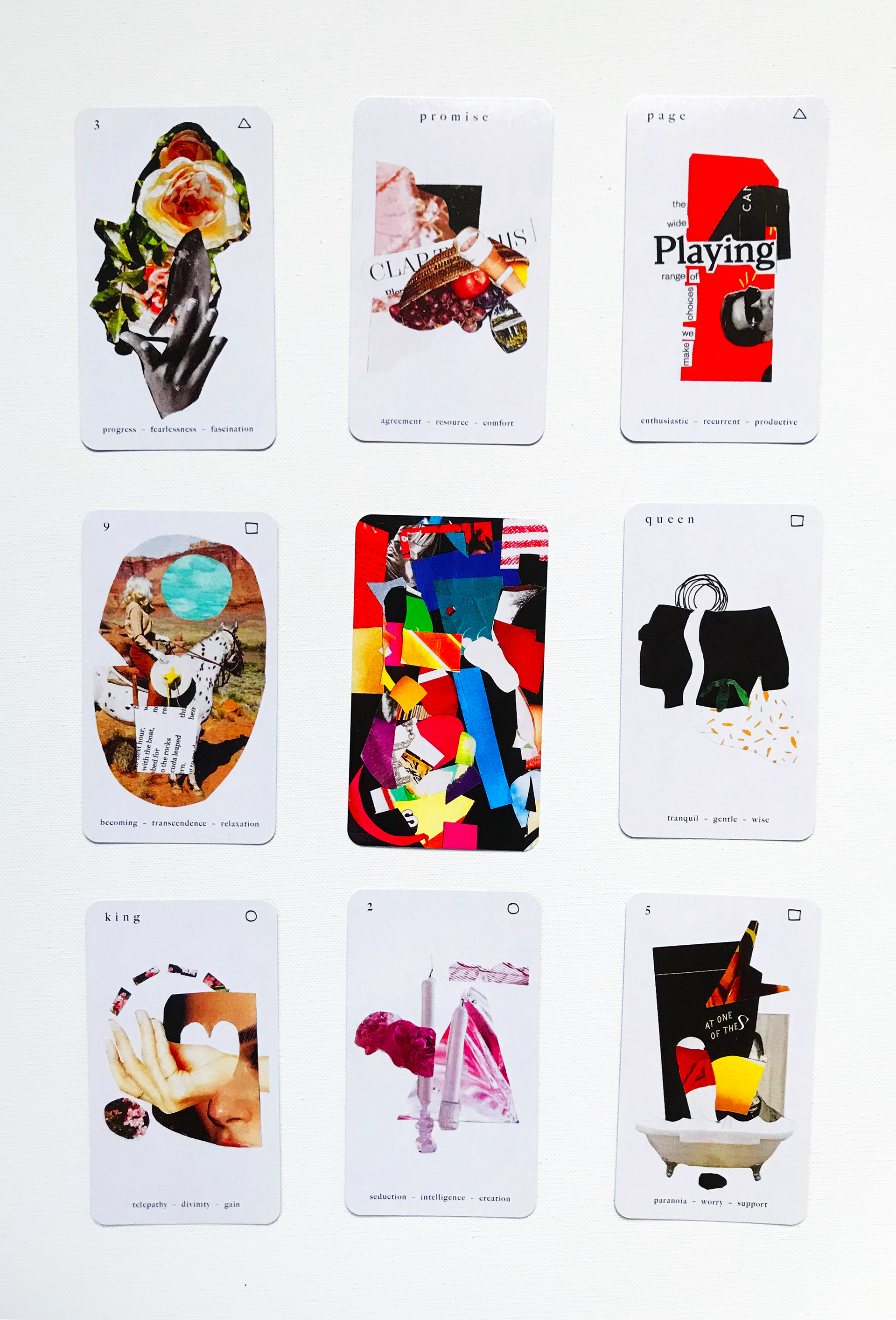
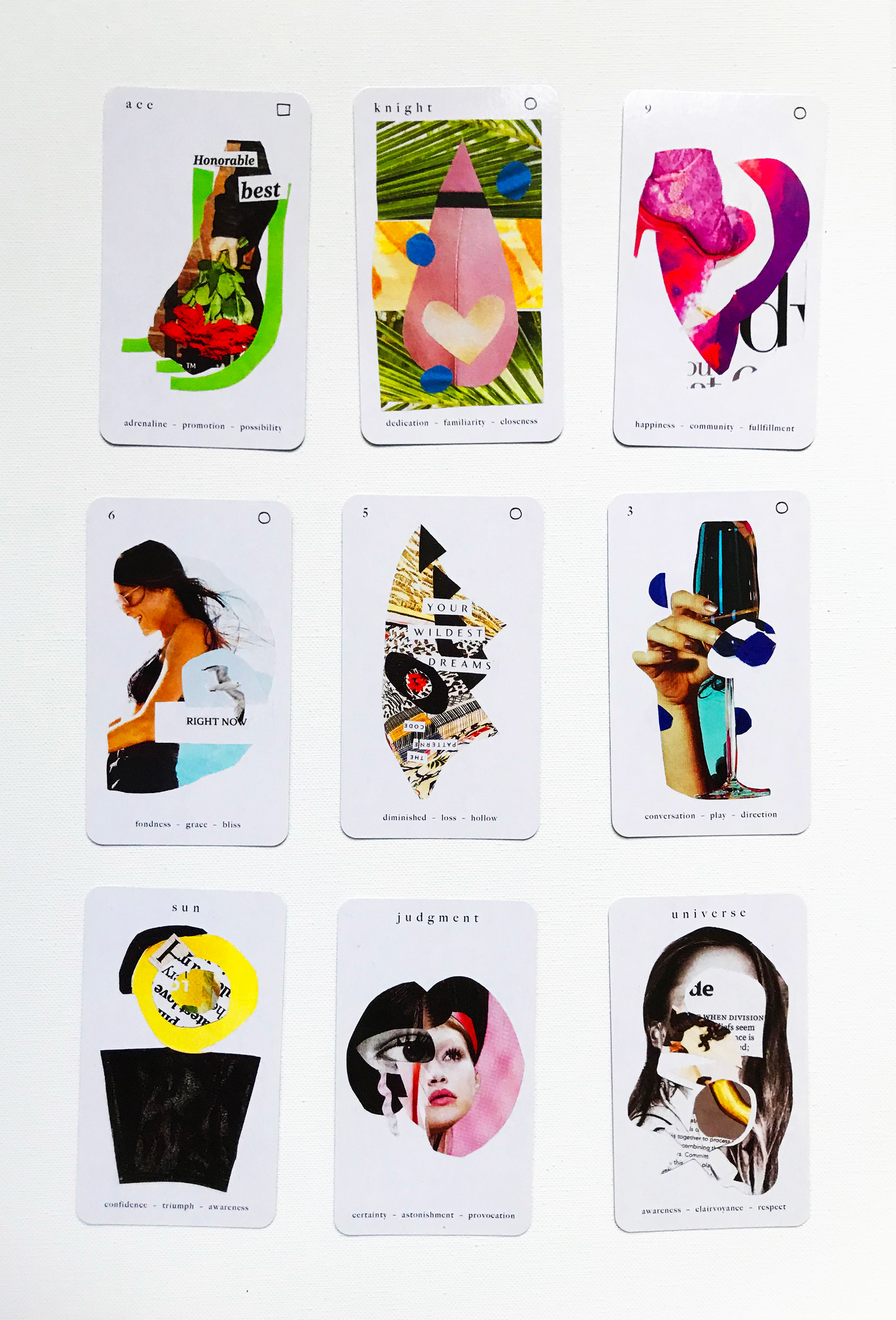
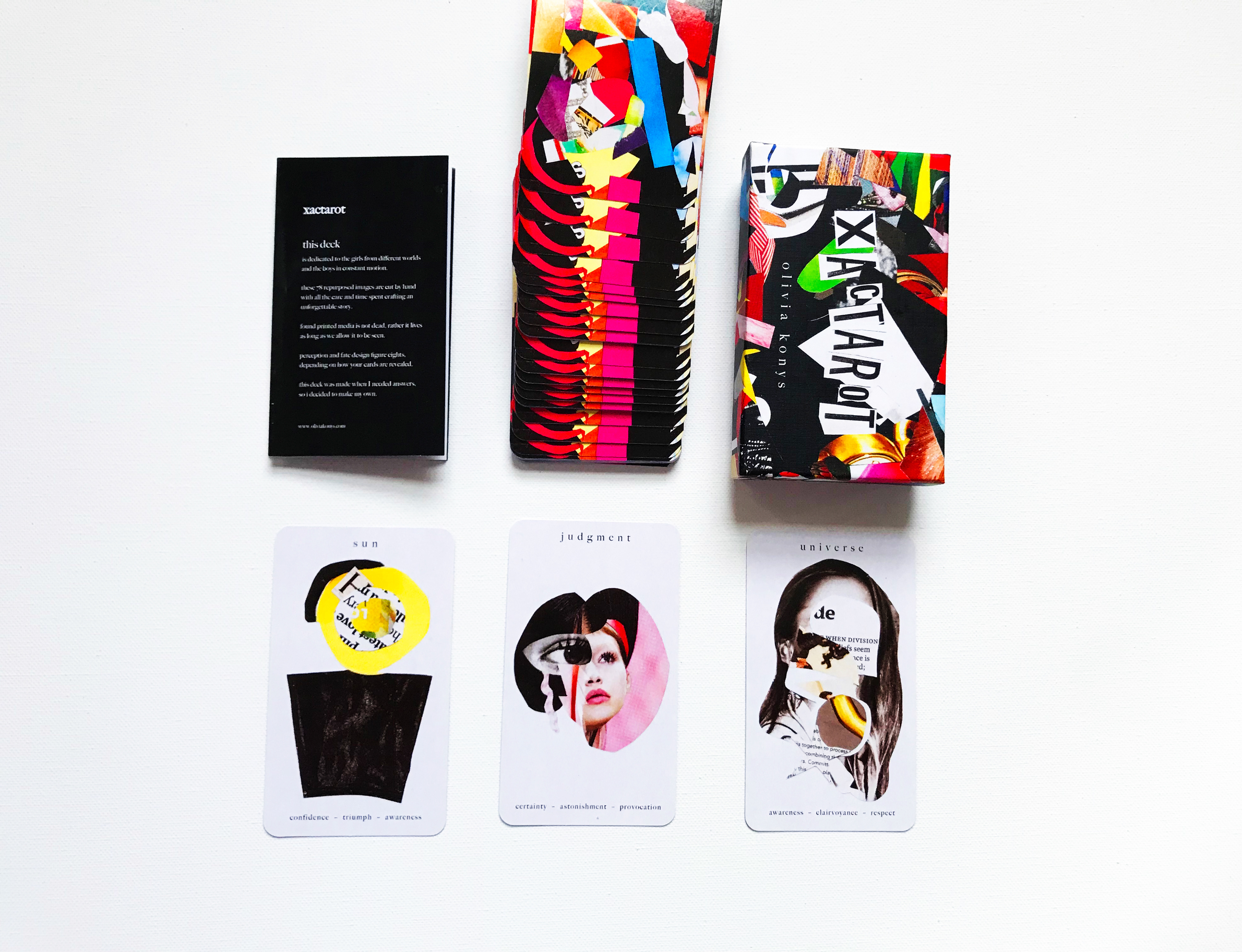
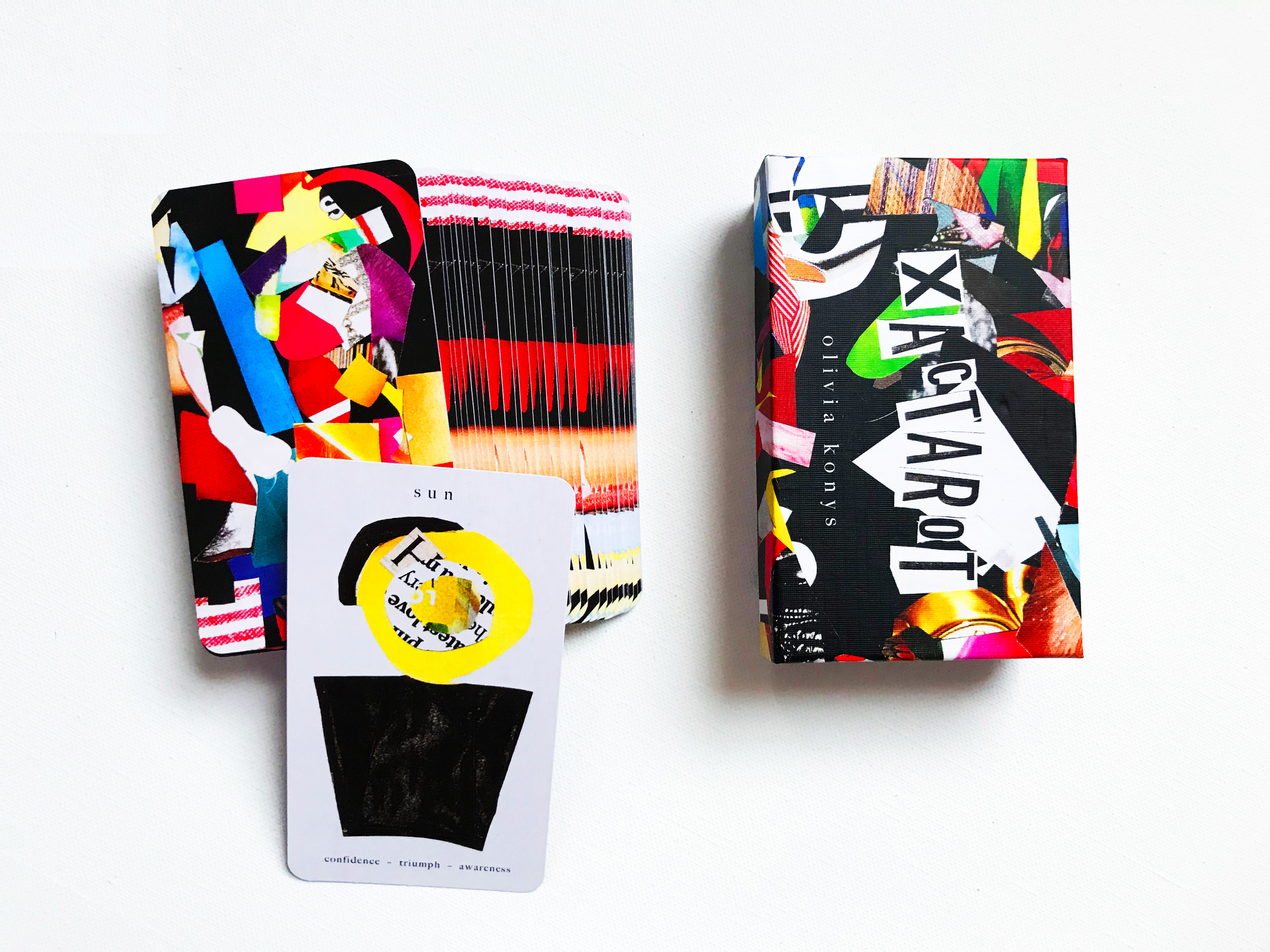
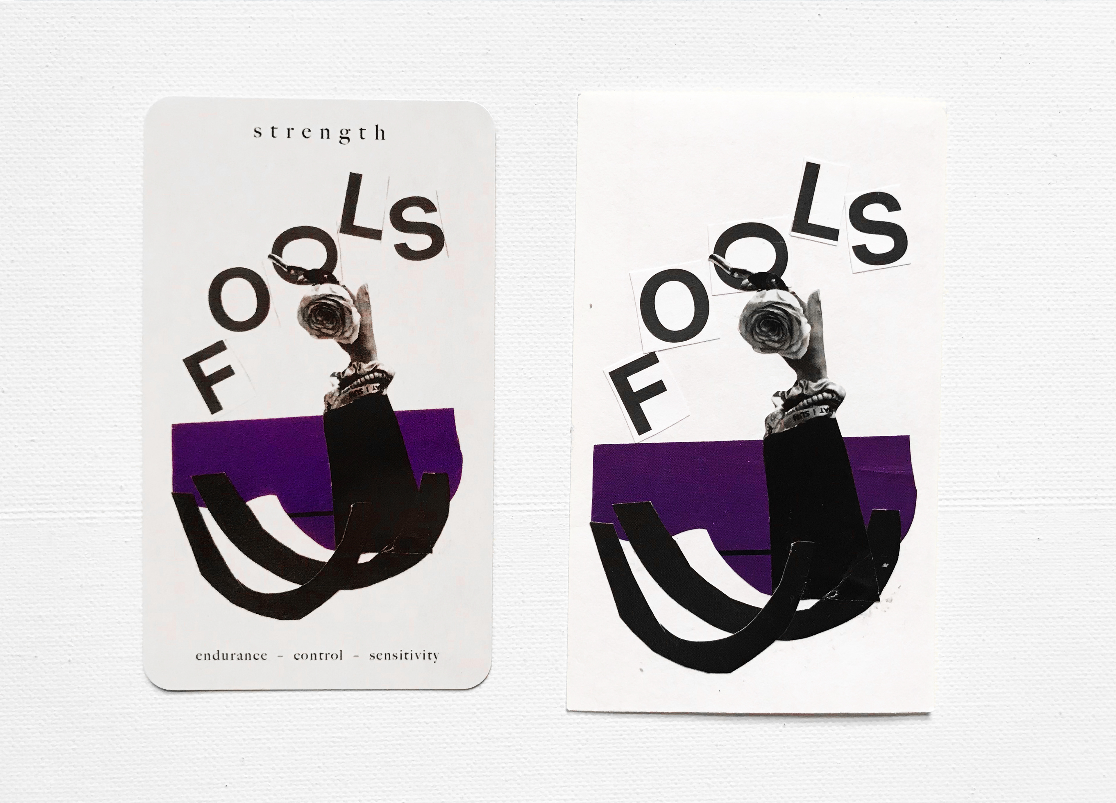
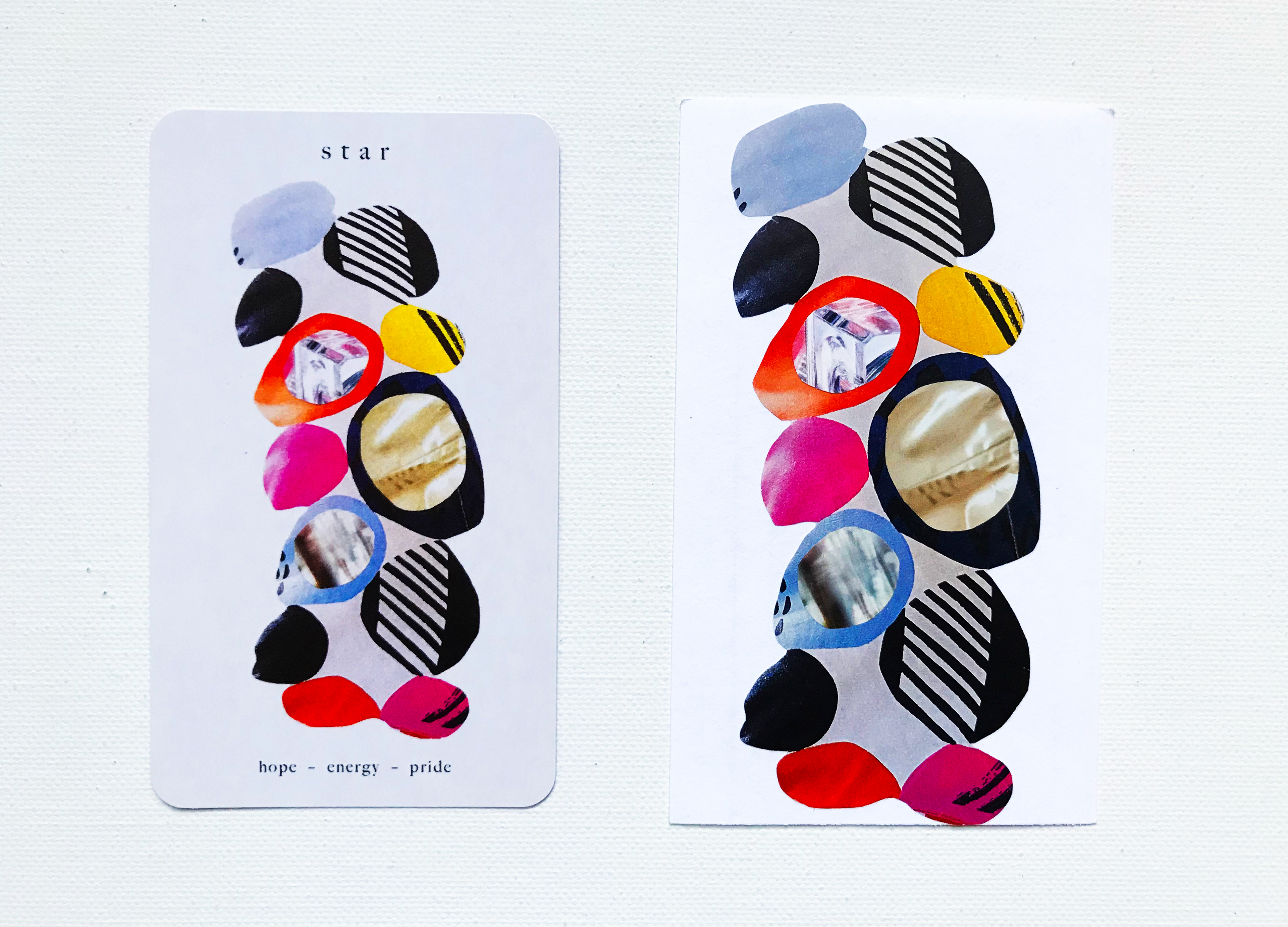
My biggest struggle while learning the tarot was remembering the nuances in numerology. Tarot is divided into two categories - the major and minor arcana - and minor arcana's 4 subcategories and 14 numerologies, combined with learning both upright and reversal readings, can be daunting for a tarot reader at any level. Plus, in some instances, neighboring cards in the spread can create a confluence of tones to a reading. I wrote modernized definitions - key words to describe each card in both arcanas - to include on the cards themselves. This is not traditional to a tarot card card as the iconography primarily drives the intuitive guide. However, I focused my definitions on accurate, yet open-ended descriptions that allows anyone at any level to read their cards, without a tarot definition guidebook as a crutch.
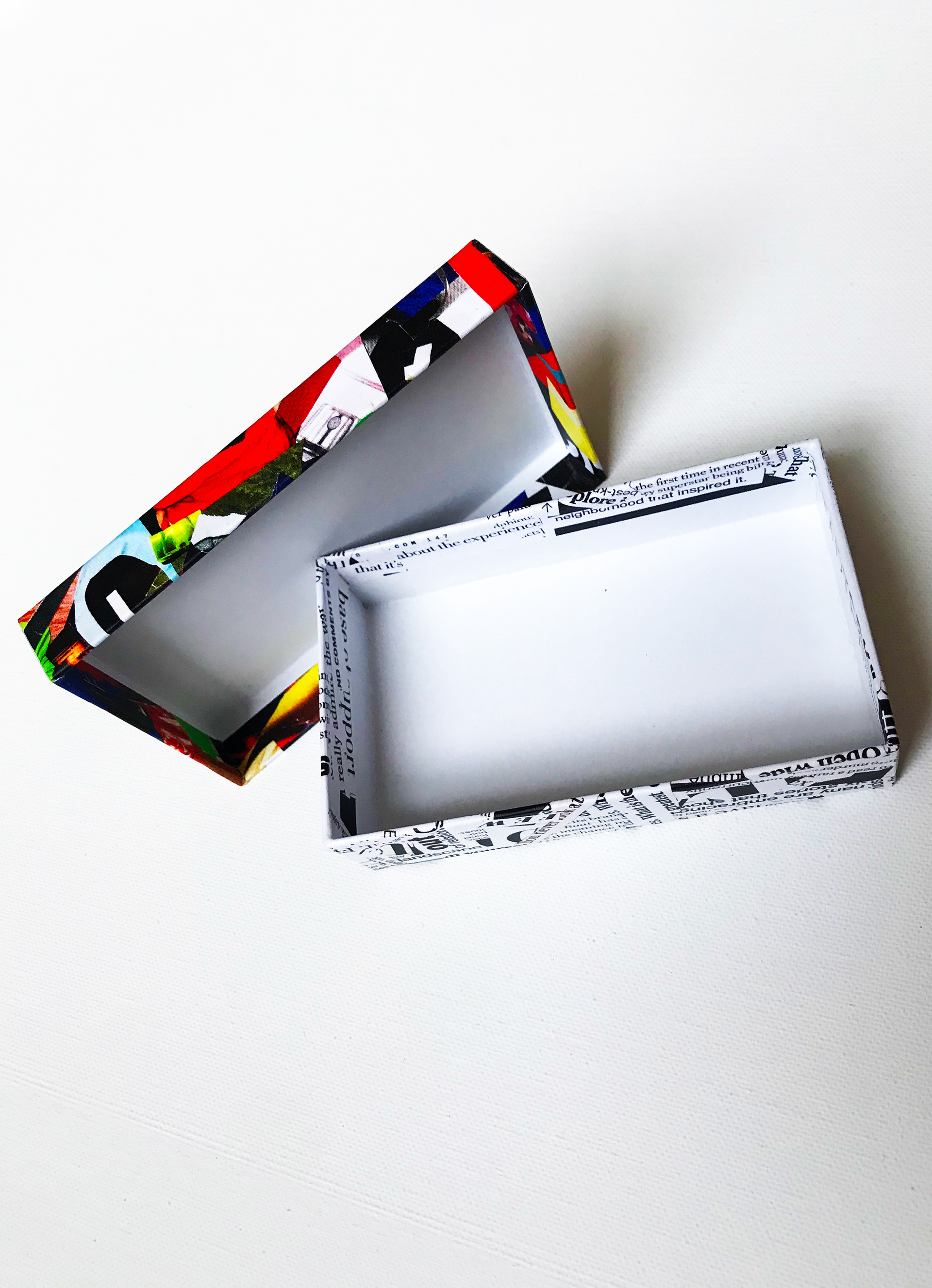
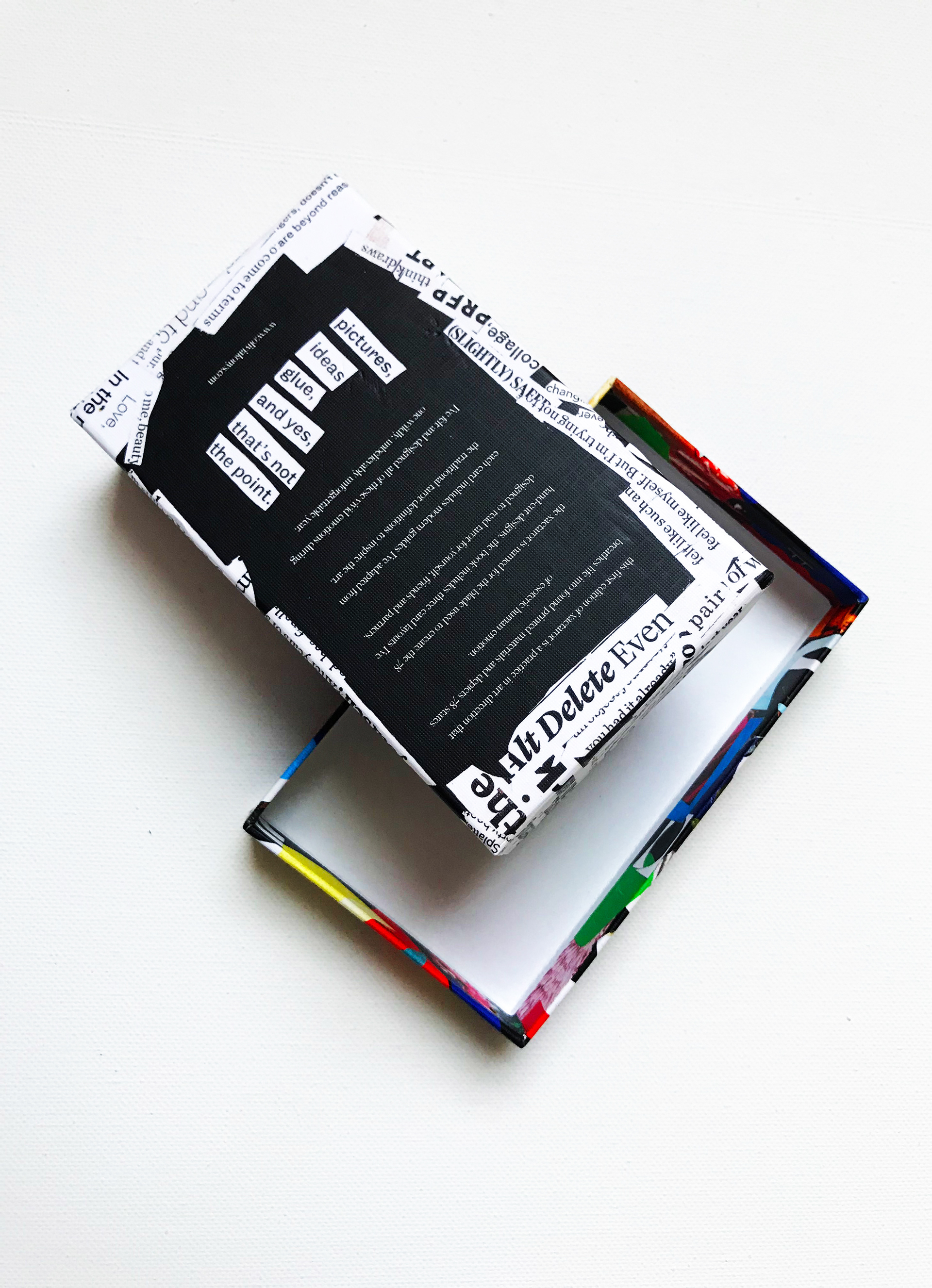
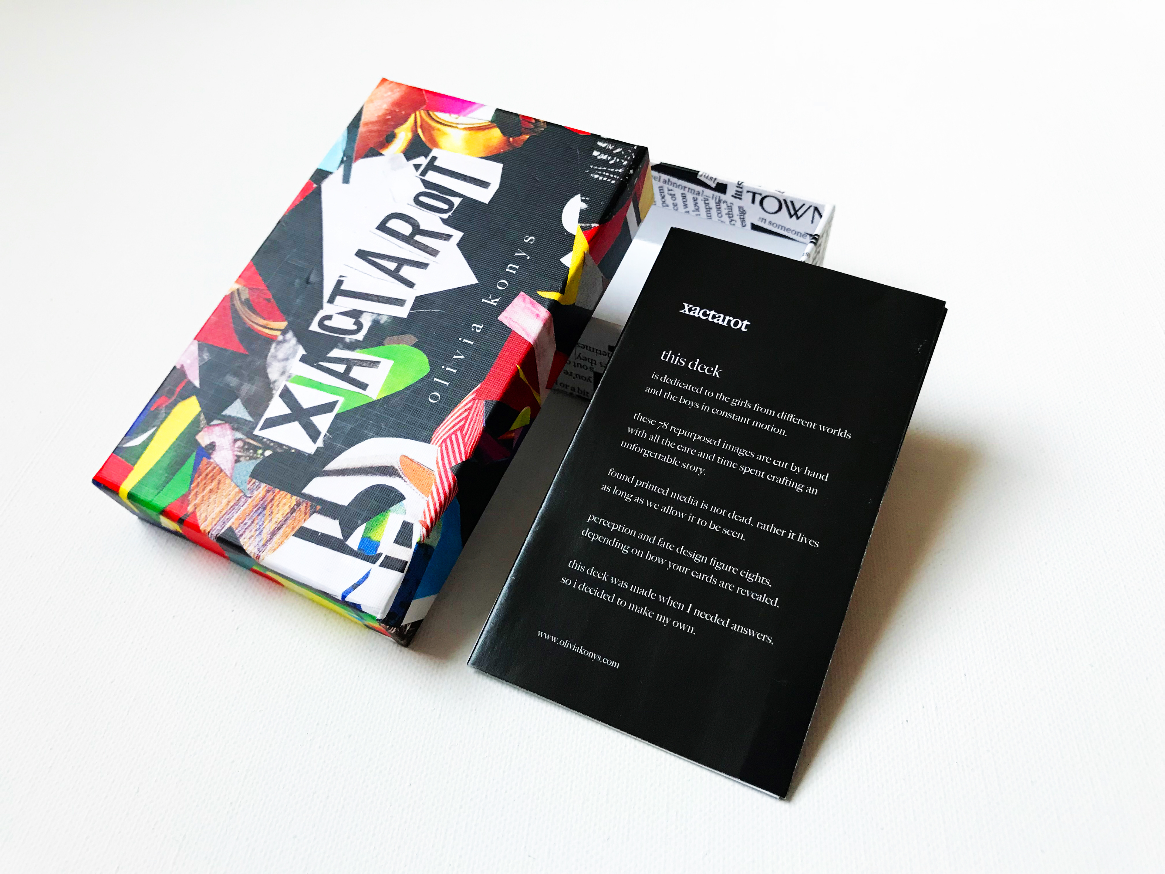
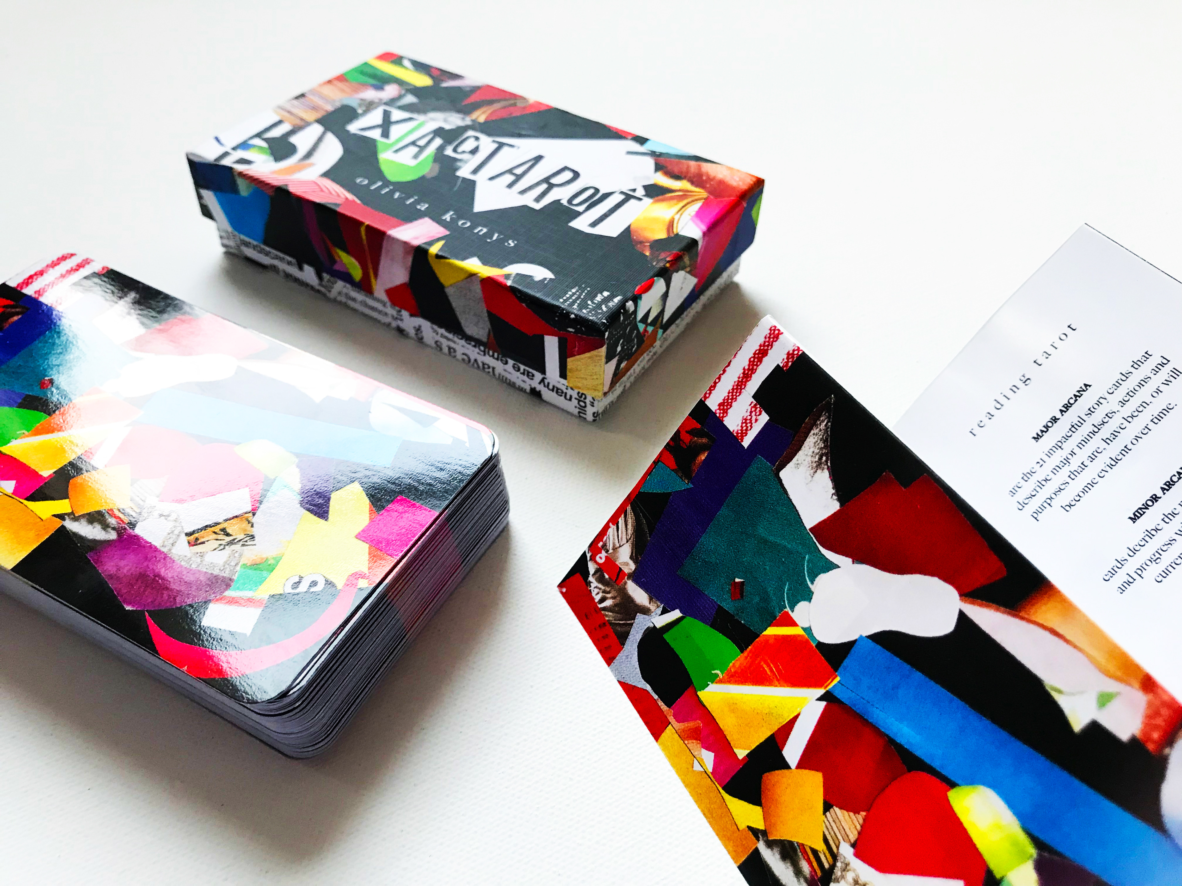
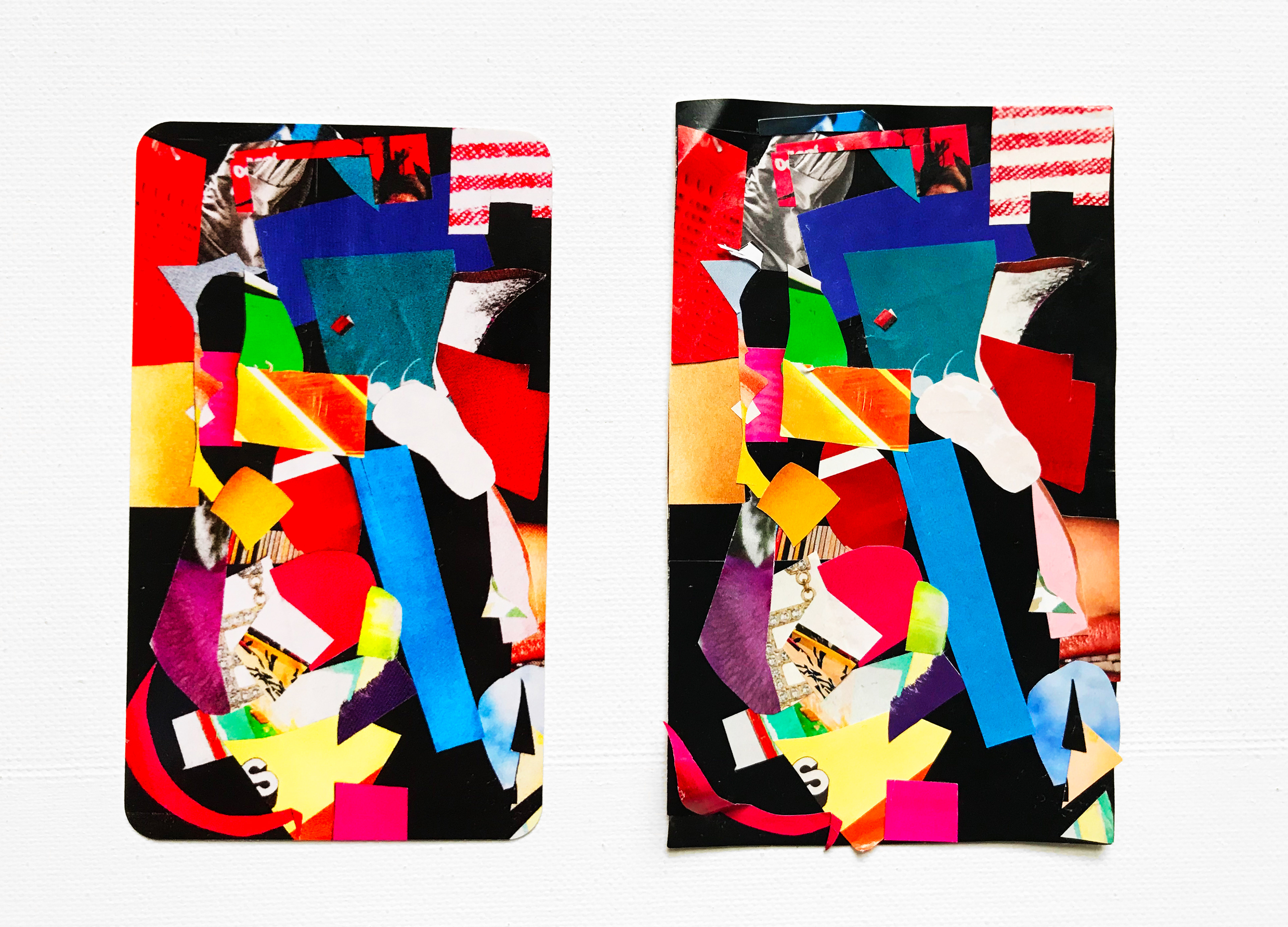
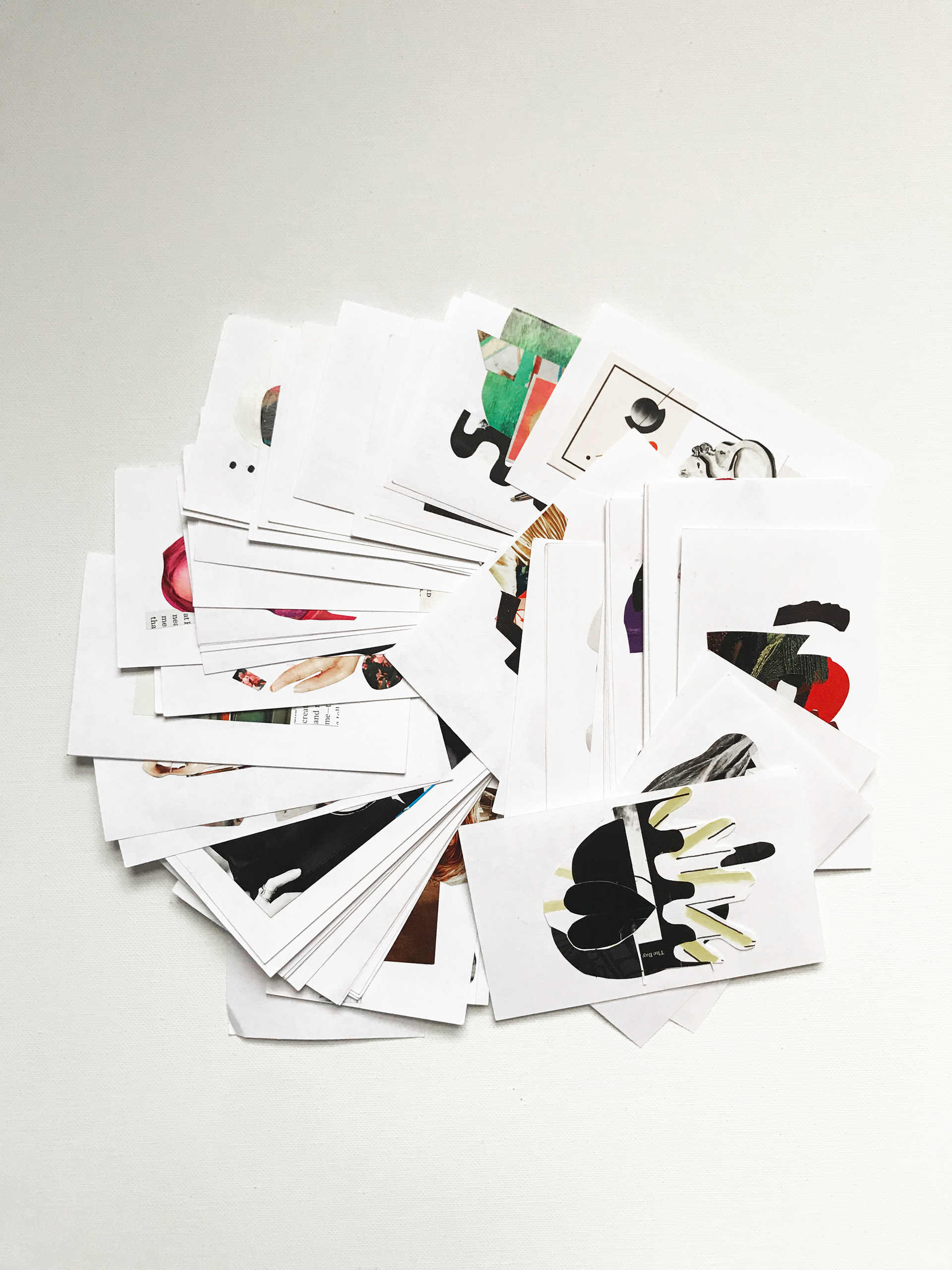
The scrapped elements from cutting the artwork falls together for the packaging design of the deck. The top half, on a black background to contrast with the executed designs of the cards on white. The bottom half, scraps of words ranging from random to relatable during this year of card creation. The card designs themselves are a marriage of the two styles, meeting at a point where the obvious visuals or copy create grander, abstract pieces.
Designing the scrap elements cut from the cards into the deck's packaging fit my vision of revival, longevity and sustainability for this deck. Print is only as dead as you make it. These discarded prints that contain campaigns, images and stories of the past year may have been lost to time, in time, but they find new life and live on in this deck. You can’t use a delete button on something you hold in your hands.
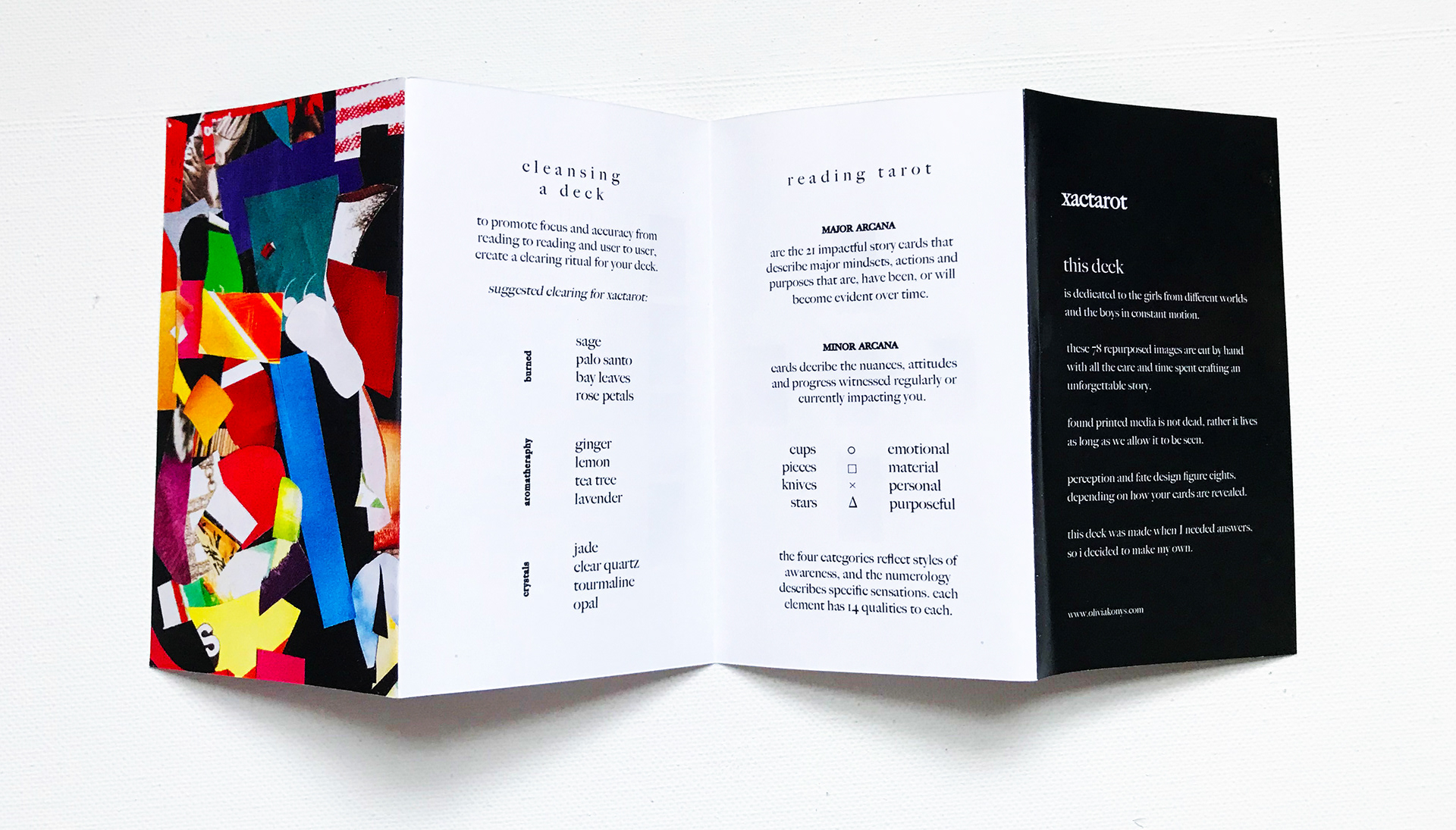
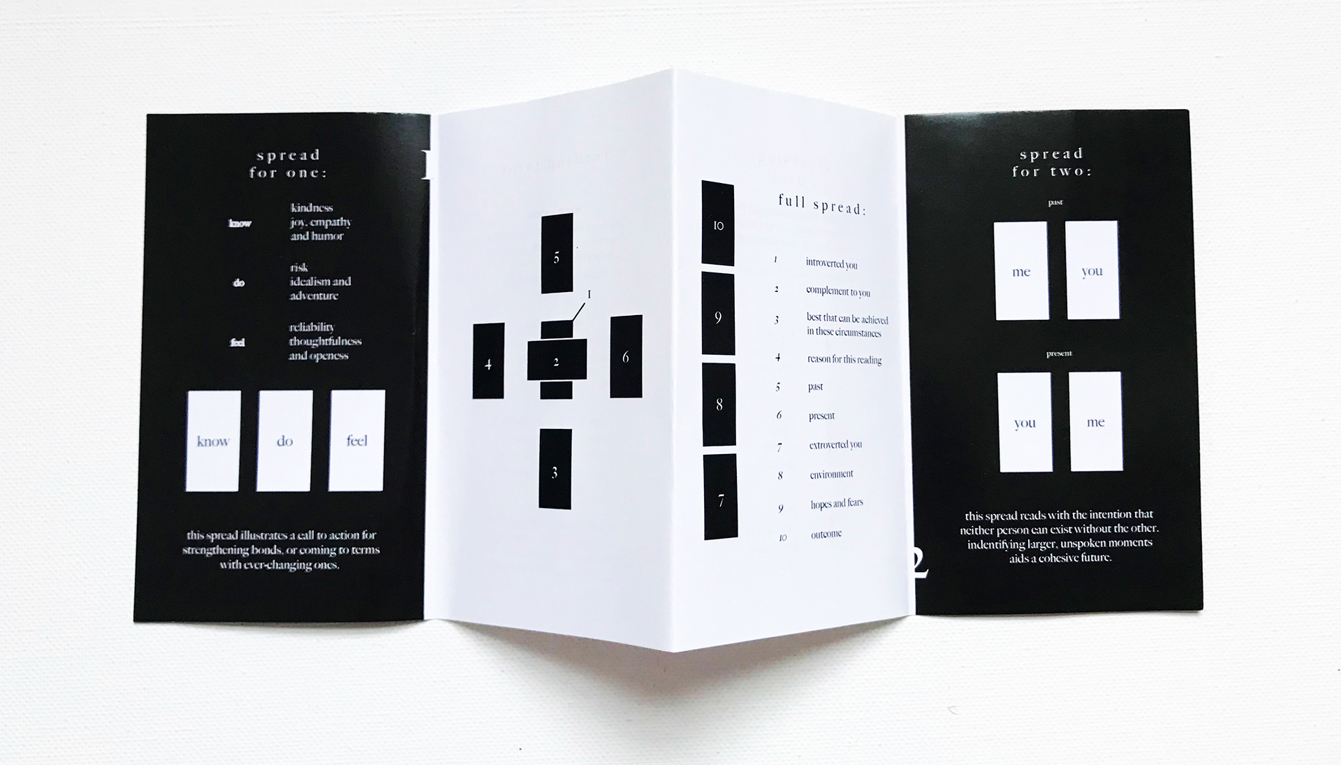
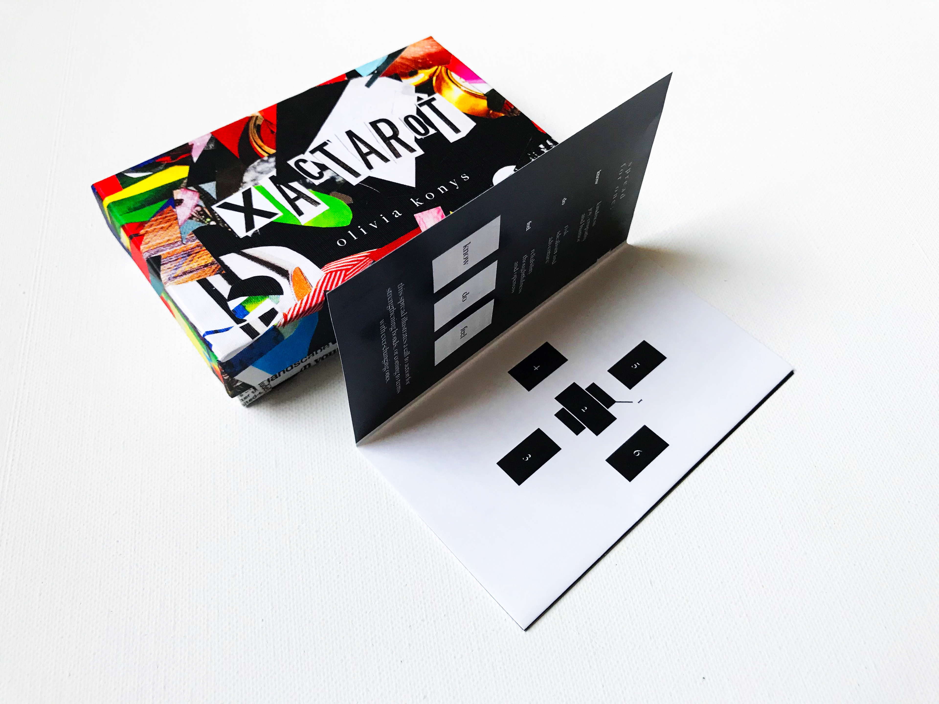
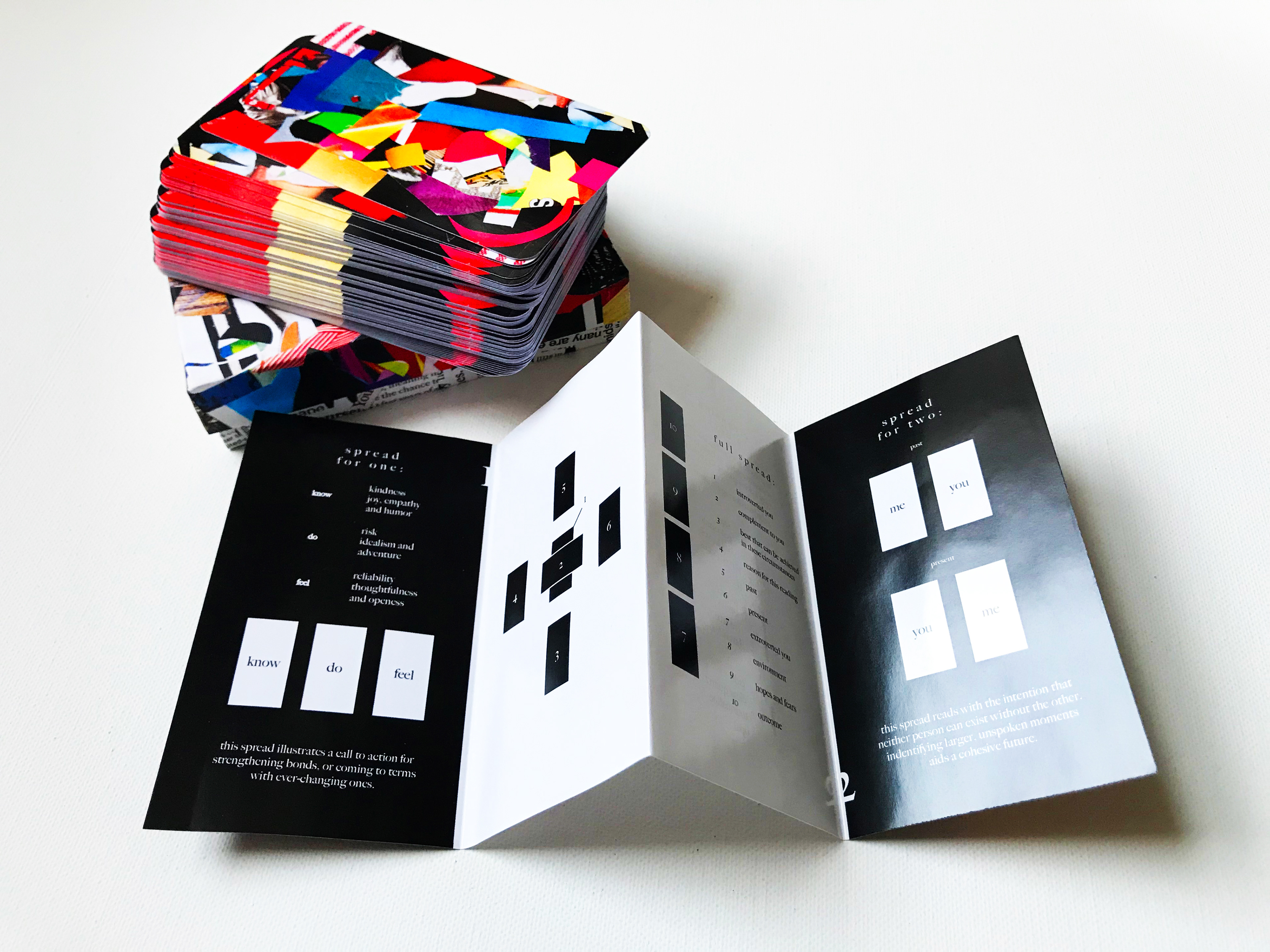
The accordion-style booklet provides instructions to begin reading tarot. It includes an adapted common tarot spread I first learned to read with and two spreads I've developed on my own for specific and more advanced readings. I've written specific crystology and cleansing rituals for the deck after studying the herbalist practices that I learned are traditional to tarot reading. The personalization of the practice is endless and valuable to anyone reading tarot - and I believe that same methodology can be said for artists.

This first edition of Xactarot is a practice in art direction that breathes life into found printed materials and depicts 78 states of esoteric human emotion. The Xactarot is named for the blade used to create the 78 hand-cut designs. The book includes three card layouts I’ve designed to read tarot for yourself, friends and partners. each card includes modern guides I’ve adapted from the traditional tarot definitions to inspire the art. I’ve felt and designed all of these vivid emotions during one wildly, unbelievably unforgettable year.
I created the mechanical files for the booklet, series of cards, and box mechanical to complete the project by hand at full scale. The mechanicals for the box are cards were built by hand, scissors and glue, the same as the cards, to spec in life for a one-to-one scan of a working file to production.
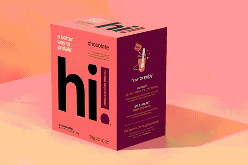
I researched different styles of boxes for card decks, and decided on a linen texture in a rigid two-part box to encapsulate the deck and booklet. The cards were produced on a glossy texture, inspired by the magazine textures the artwork elements were sourced from.
Anyone can download illustrator on the computer and teach themselves how to make designs. In fact, self-taught work should always be encouraged. I’m self-taught that way myself. But looking through hundreds of magazines and deciding what colors and images are worth cutting up by hand, and looking through the right prints in the right order at the right moment, takes an immense amount of time, patience, and coming to terms with if you cut it wrong there’s no command z out of it to cover your mistakes. There are no guides and there is no way to slow down time.
I never want to live in a world without print, without something to hold, or to give. These mentalities are interconnected. Those who choose to forgo convenience and share in print are inherently more sentimental than most. I want to bring the intuition that creates to non-artists. I want to speak my mind by design, which by design goes without speaking.
I have brought life to items that would have been thrown away, to images and designs that have been retired or replaced. I feel meaning in the same images designed by artists who create for print, whose vision came before in the distribution down to me. In a world where we consume, we should create. In a world where we delete, we must hold on. In a life where we move on, we will repurpose.
Through items we may have viewed as temporary, there is a way to revisit permanence. And there is always art to welcome you home.