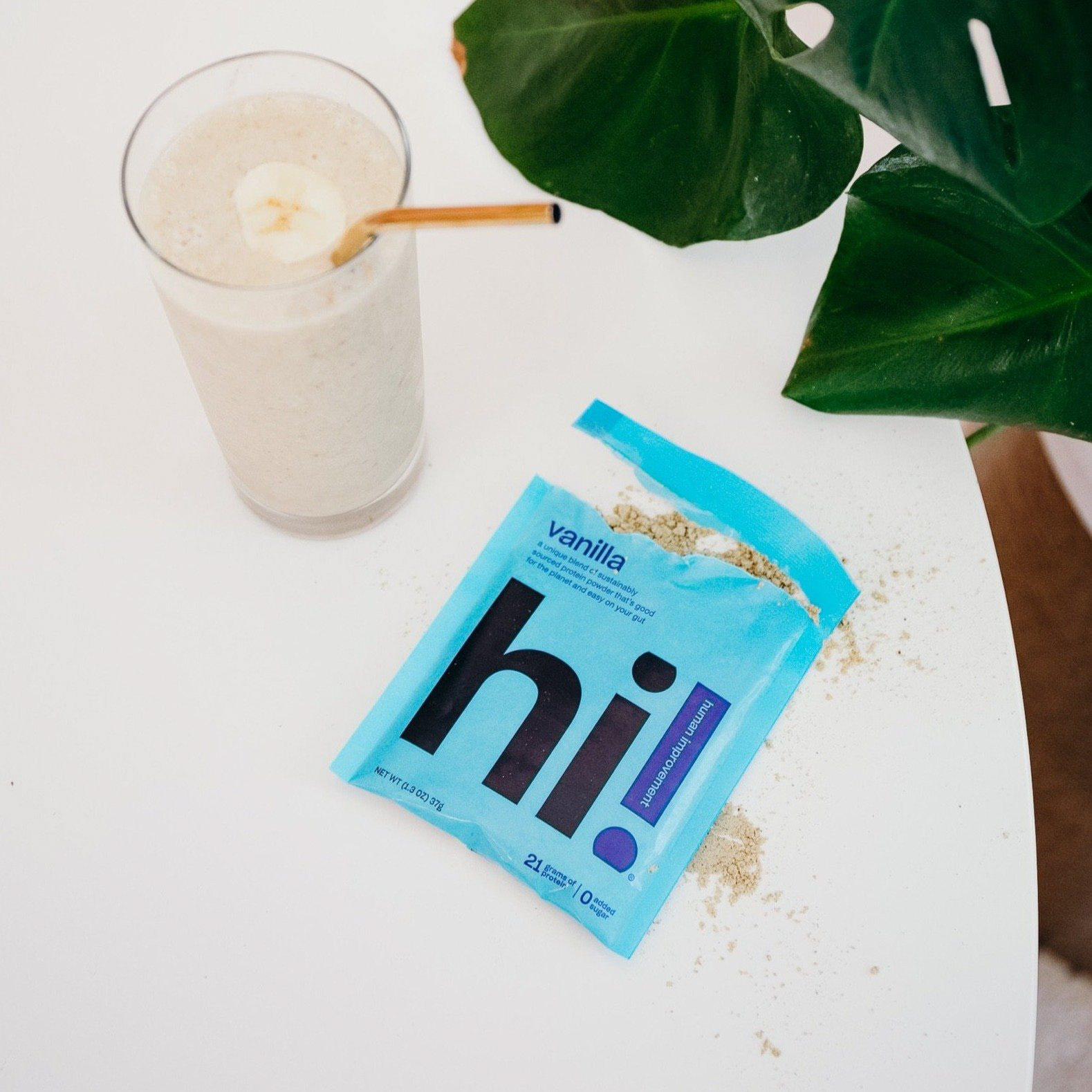
Hi! Protein is an organic, plant-based protein powder that fits within many dietary restrictions, including: to create an accessible protein powder that fuels human improvement.
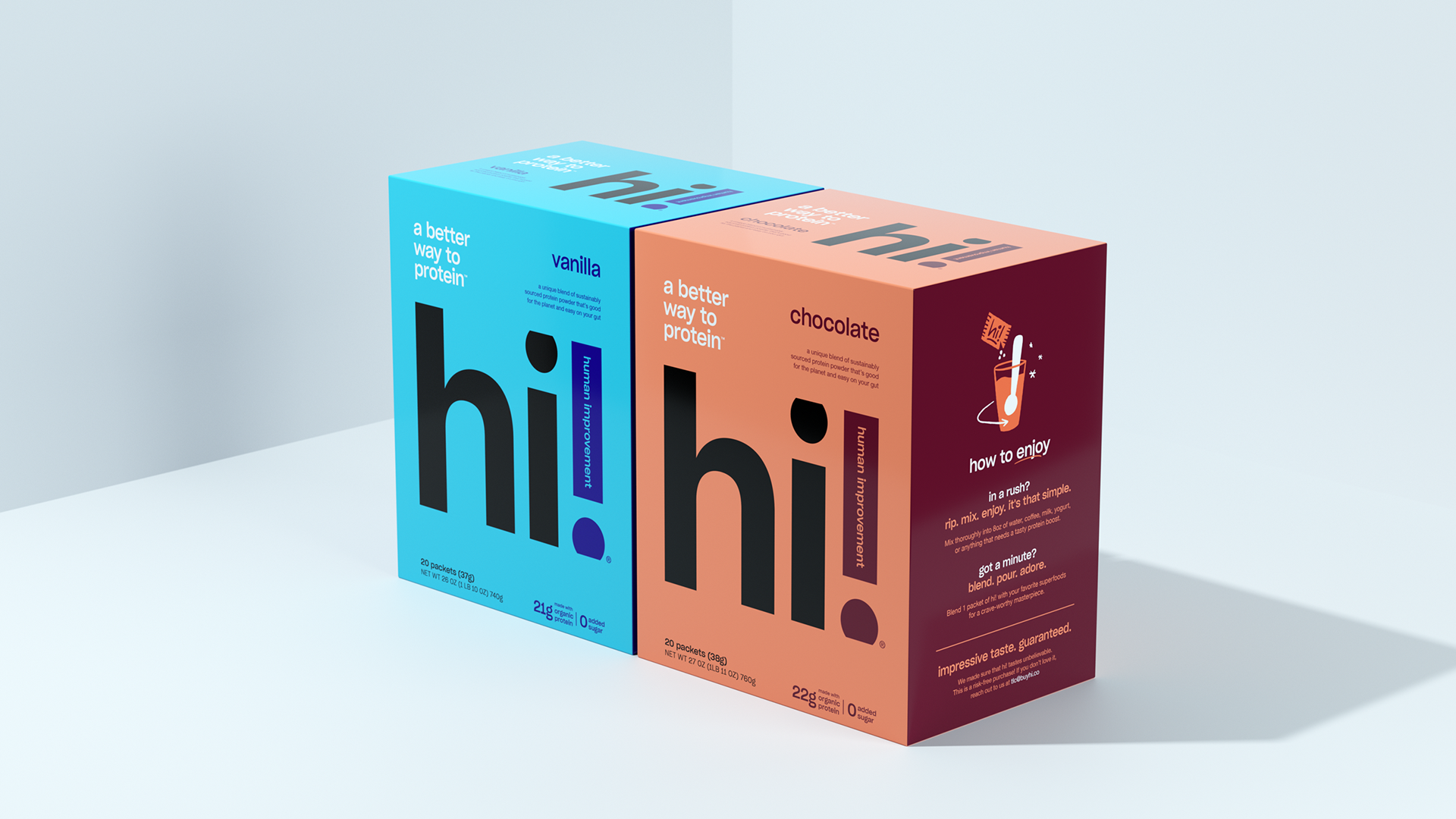
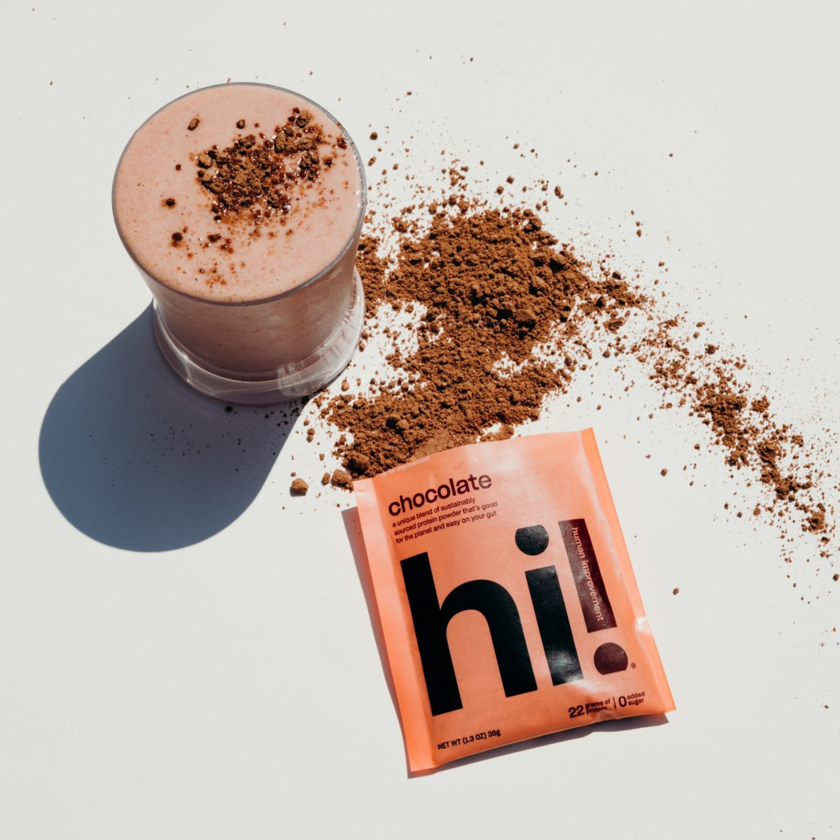
Hi! Protein's two launch flavors, Vanilla and Chocolate, incorporate brand artwork while also highlighting the flexible dietary styles that appeal to their target customer.
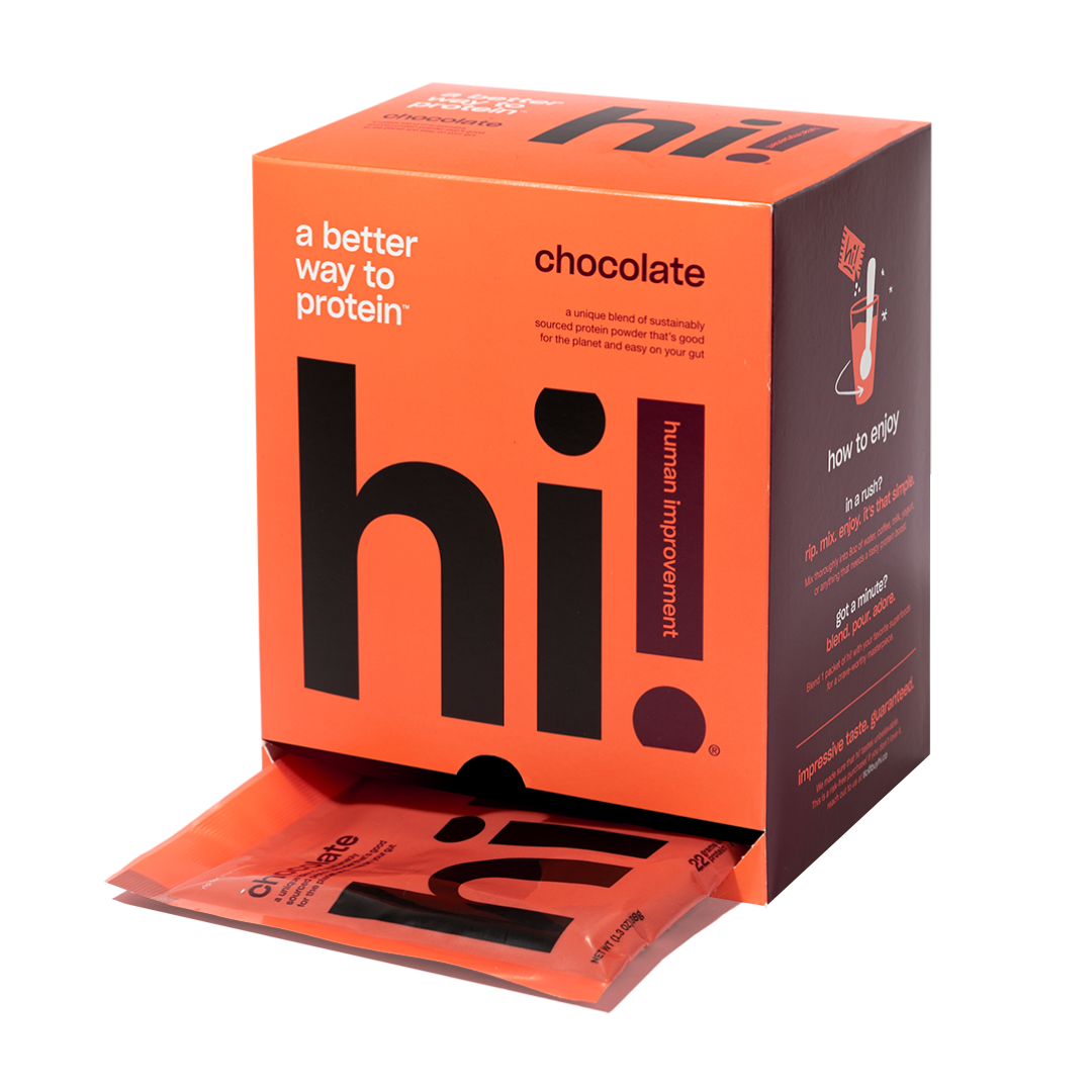
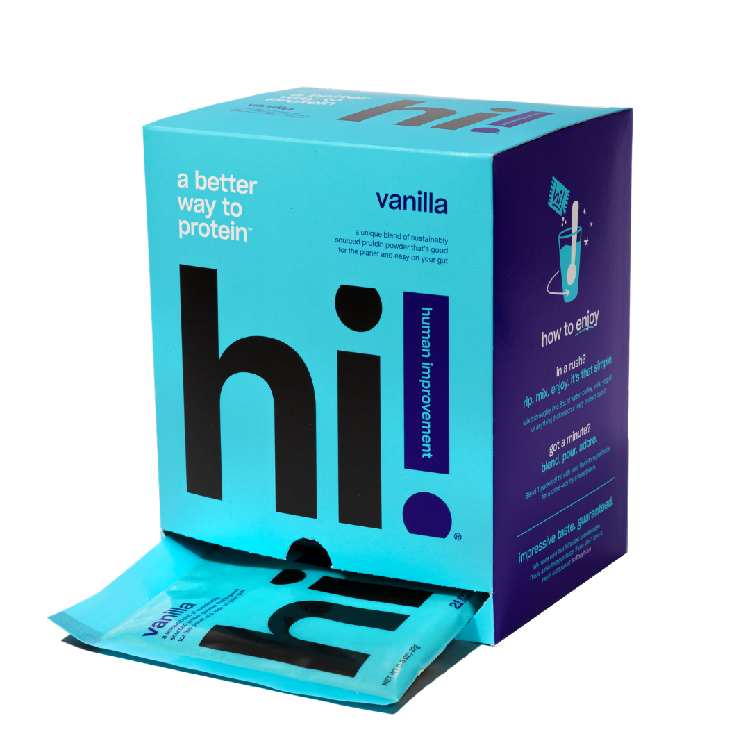
PACKAGING DESIGN
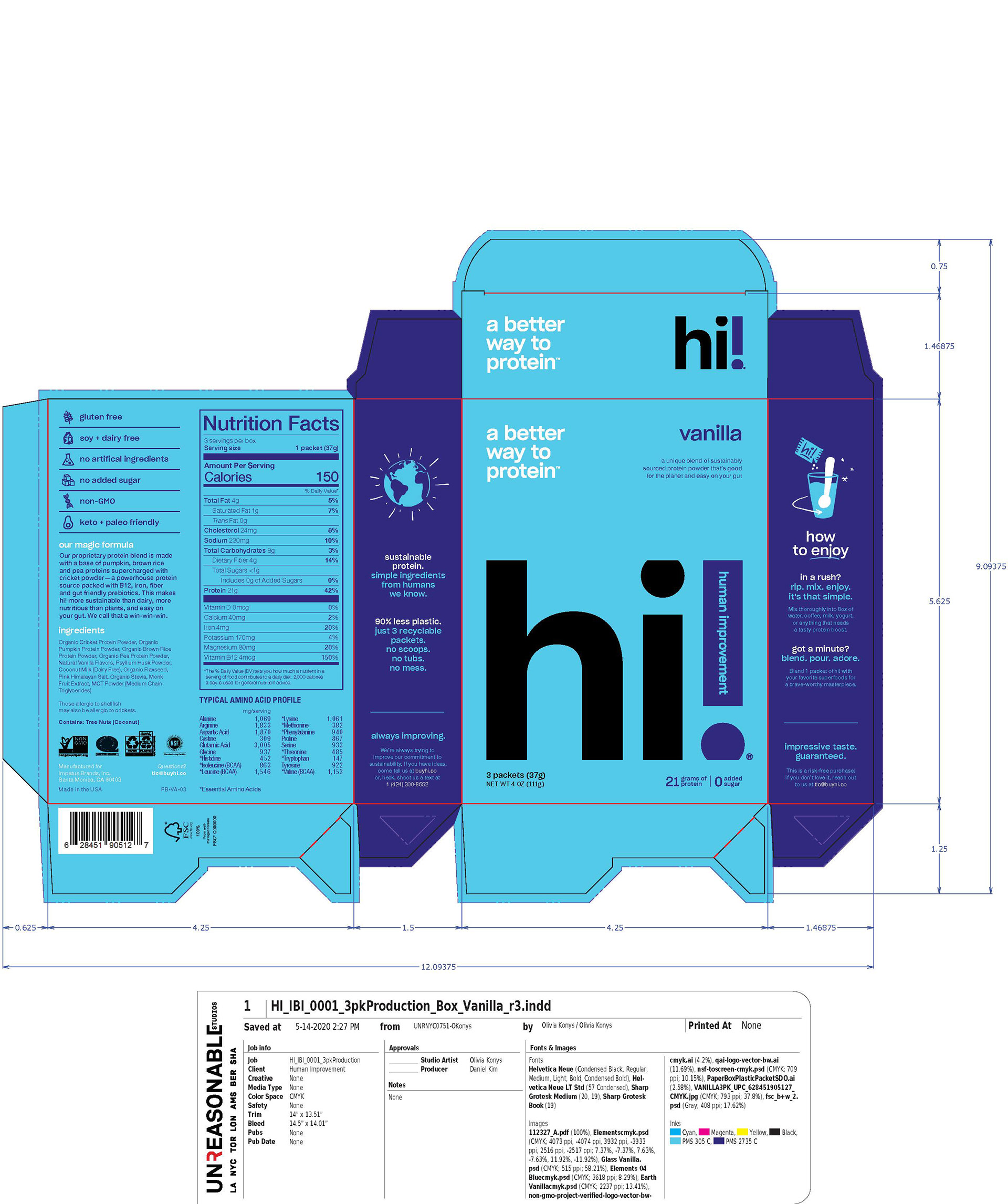
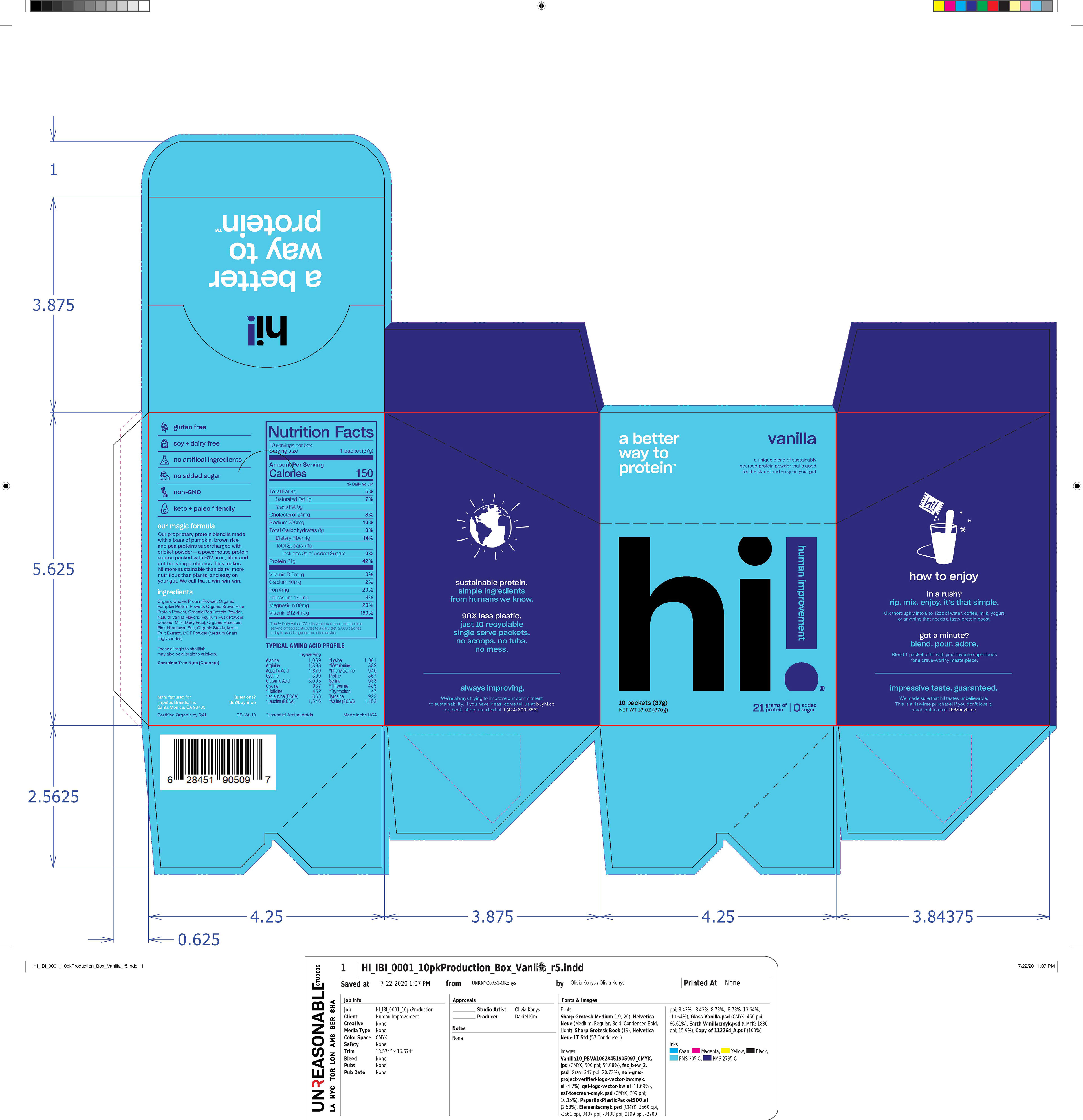
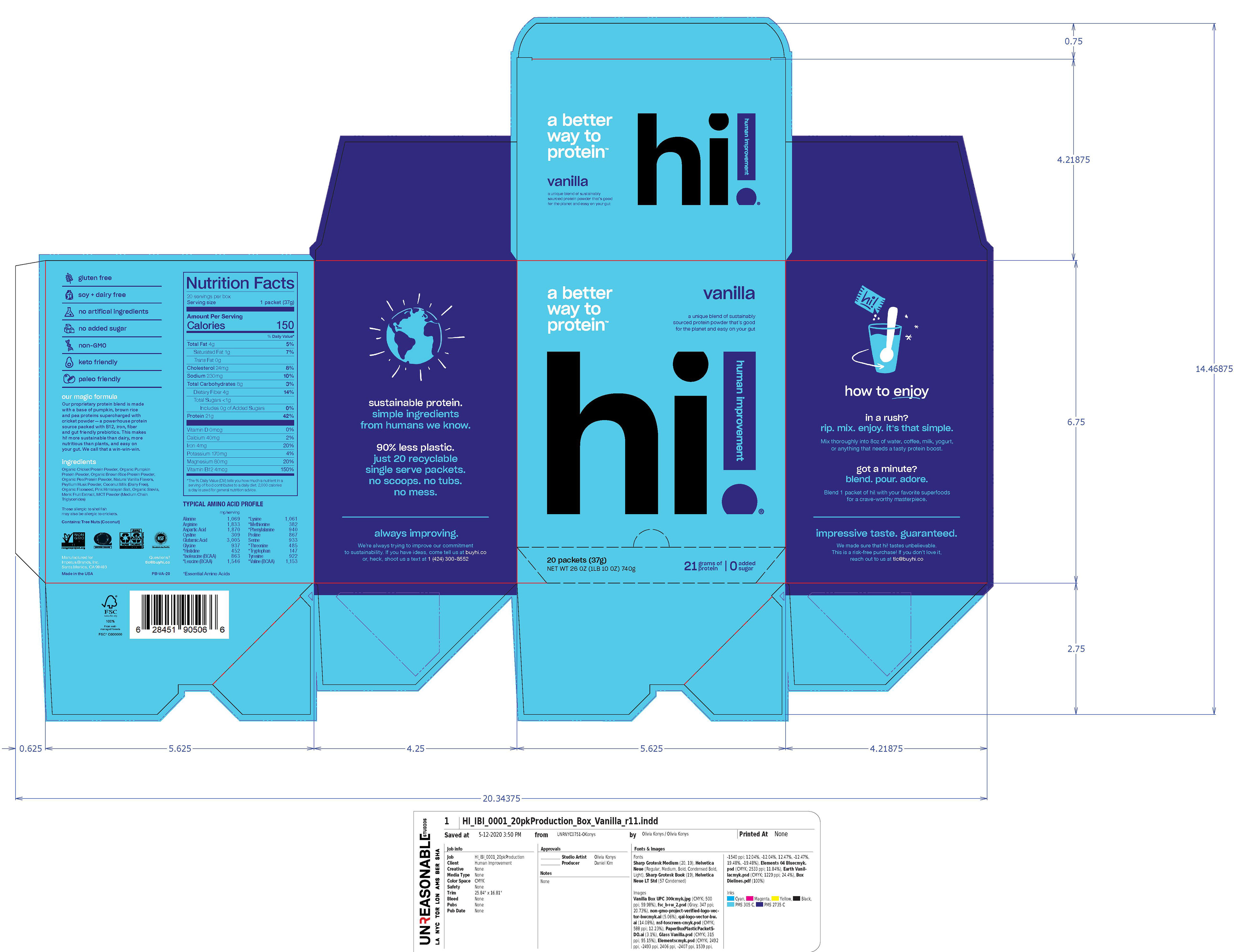
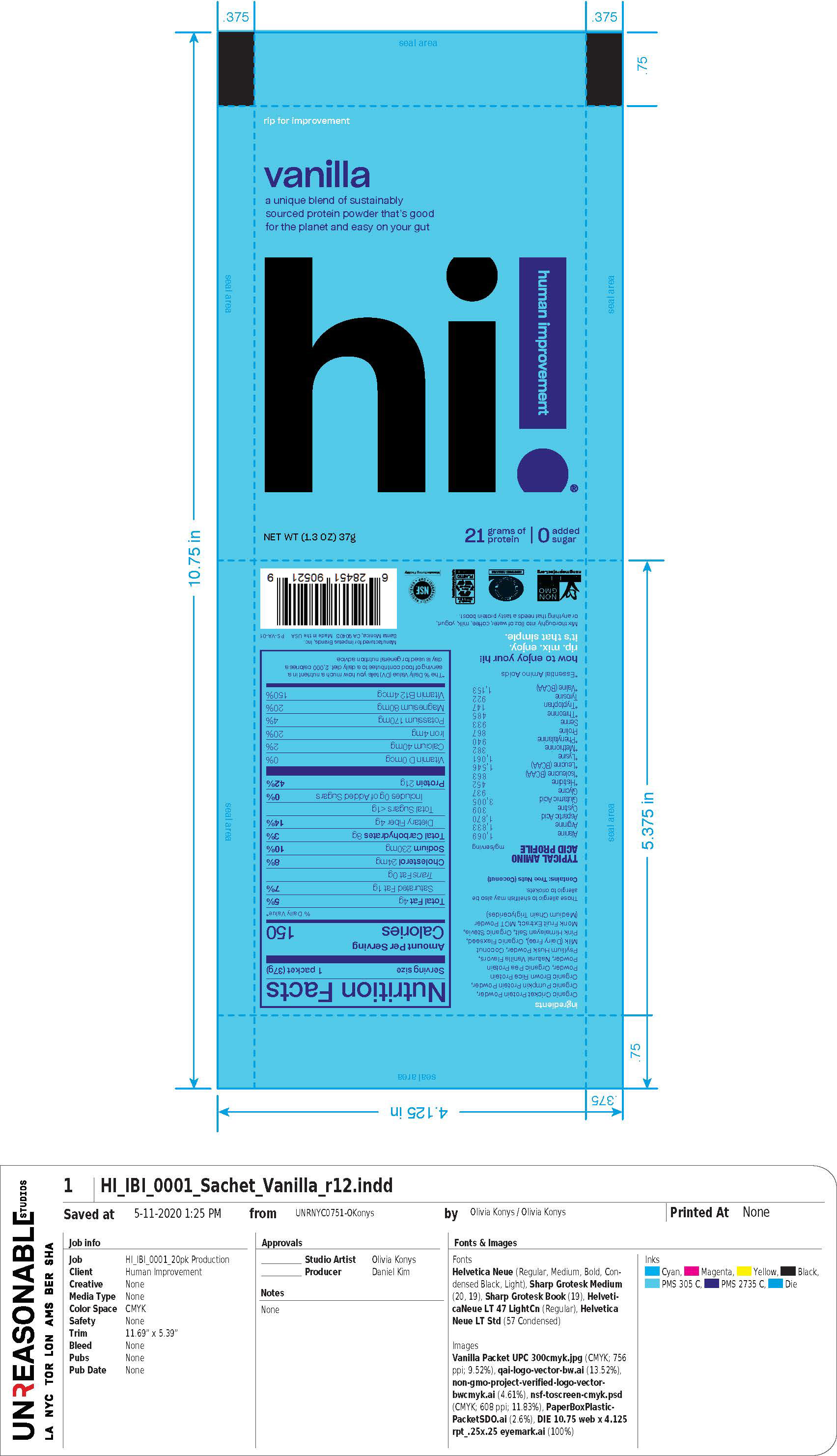
Nutrition information and ingredient lists were provided to me and designed according to FDA label requirements across four packaging sizes. A new and iconic boxed protein series with eye-catching appeal in-store was a major focus for the Hi! team in launching their new brand. I designed for FDA production requirements to mass-market the product in stores, without sacrificing their packaging design vision, and found solutions that would feature their product benefits and brand artwork alongside the required packaging information.
20-Pack Box Design
Packaging Mechanicals, Various Adapted Sizes
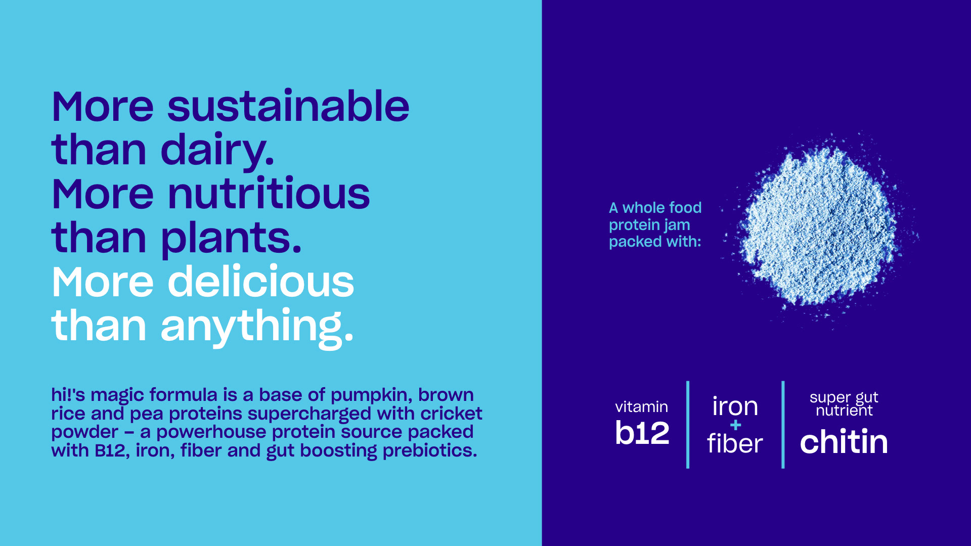
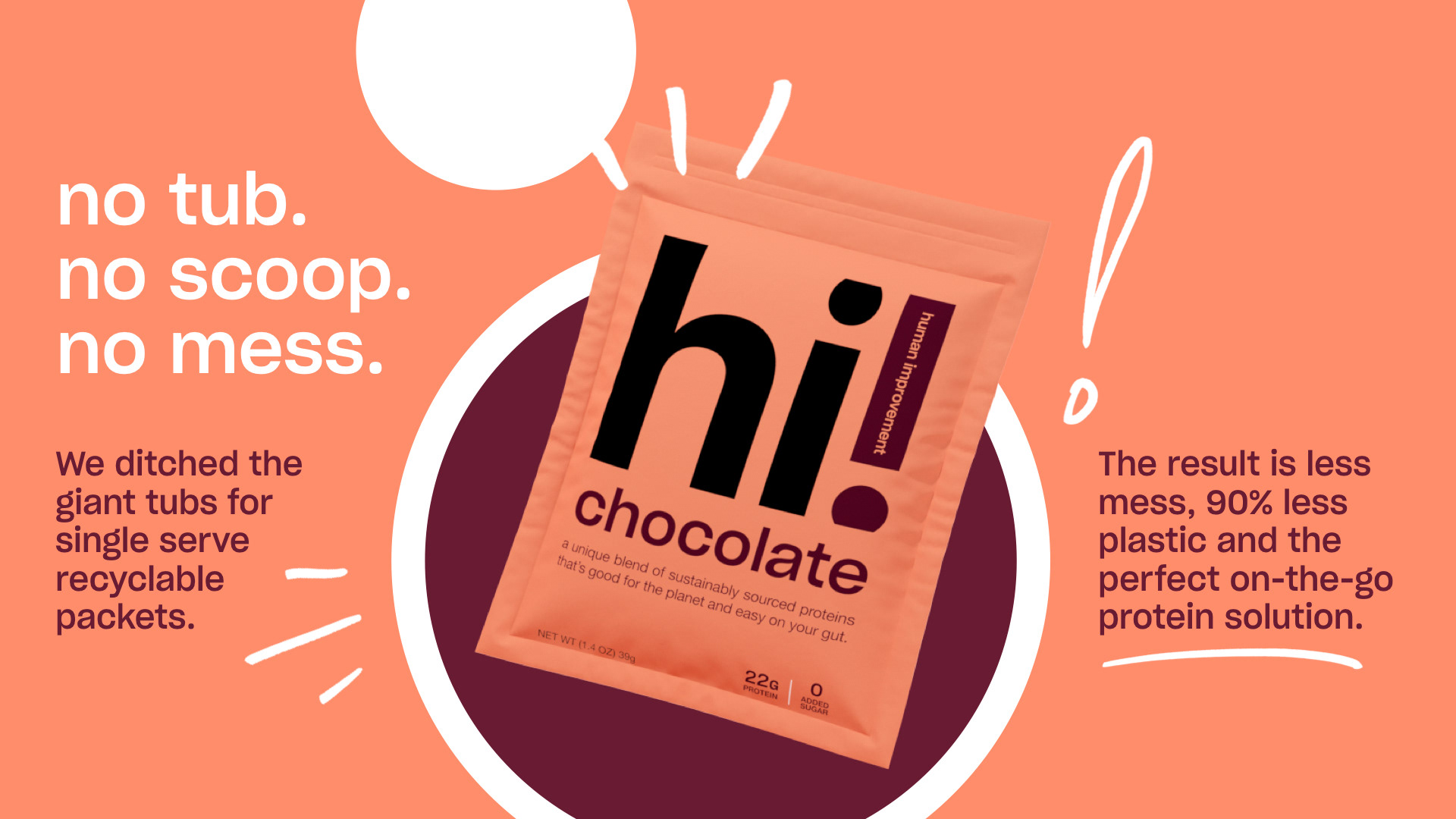
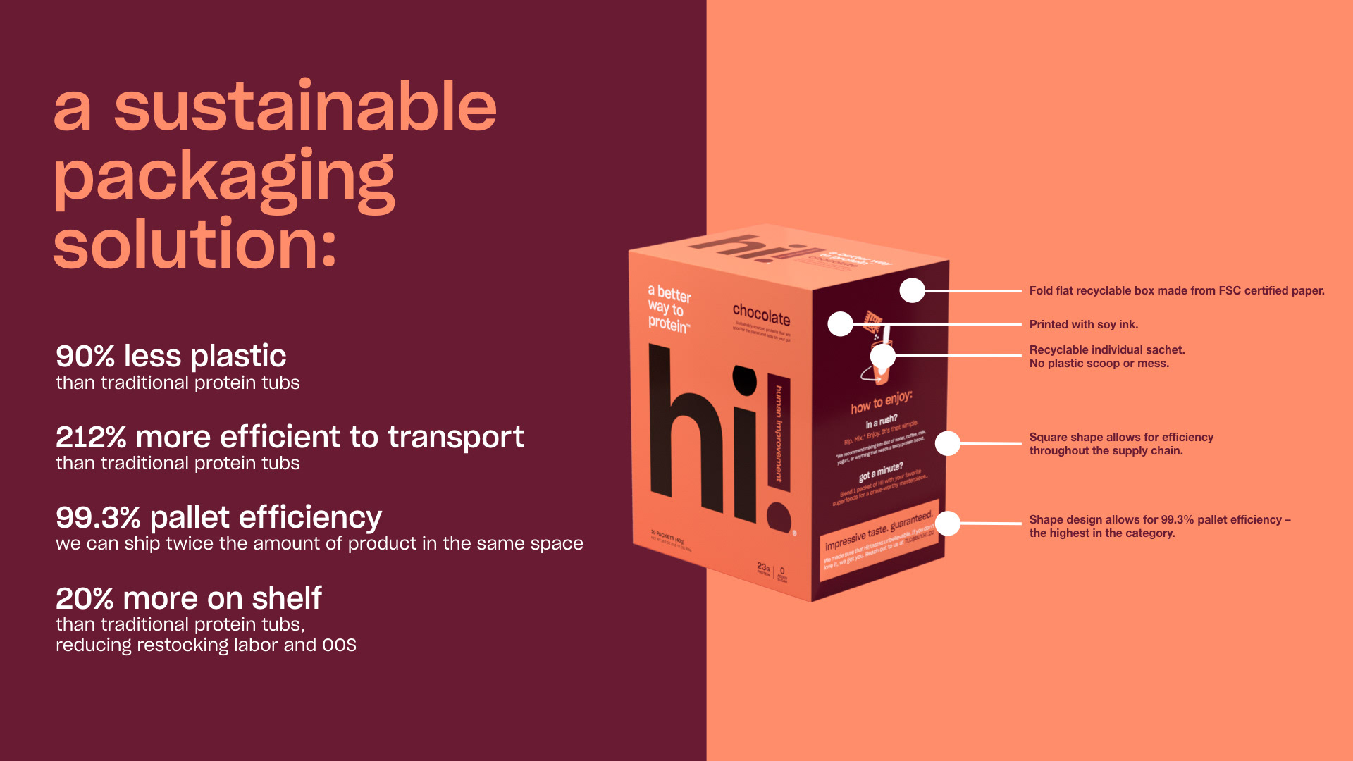
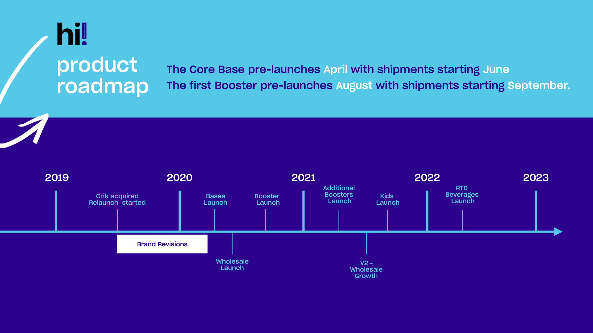
PRESENTATION DESIGN + INVESTOR DECK
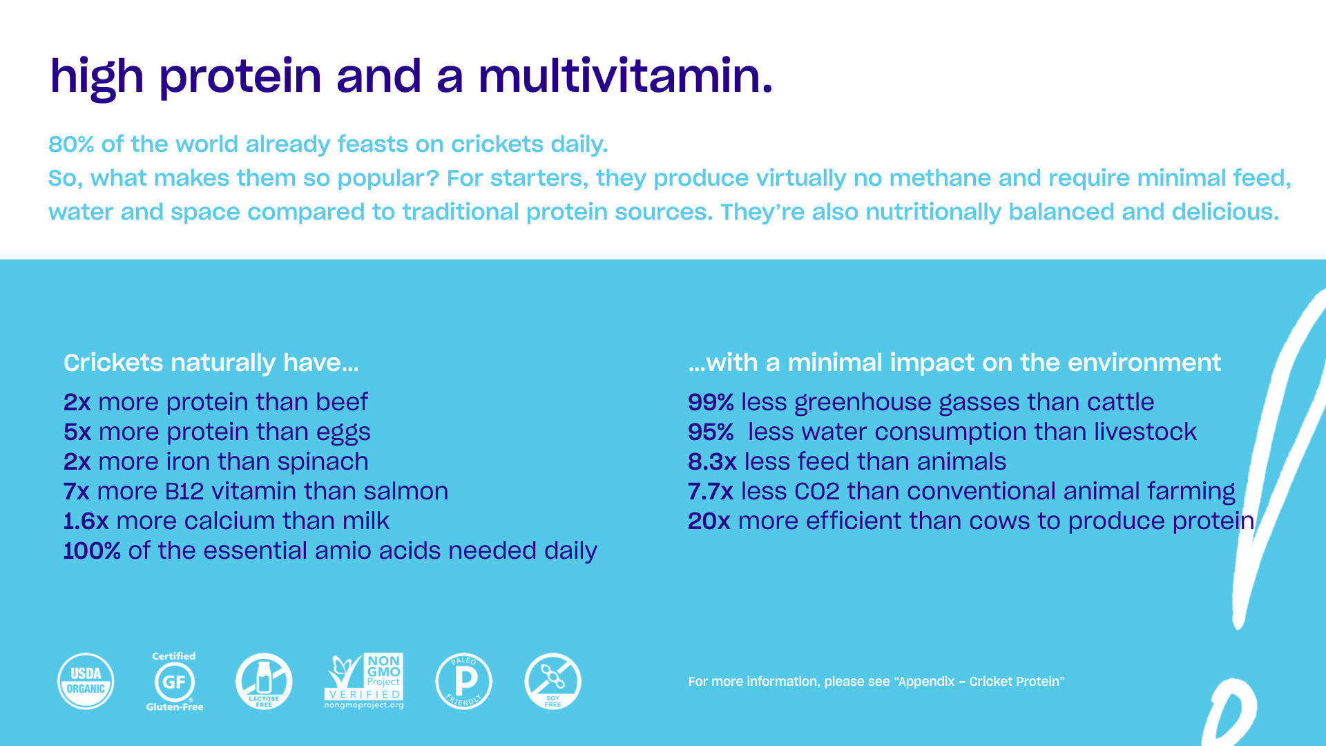
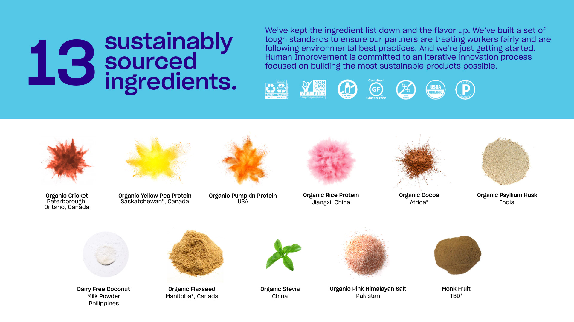
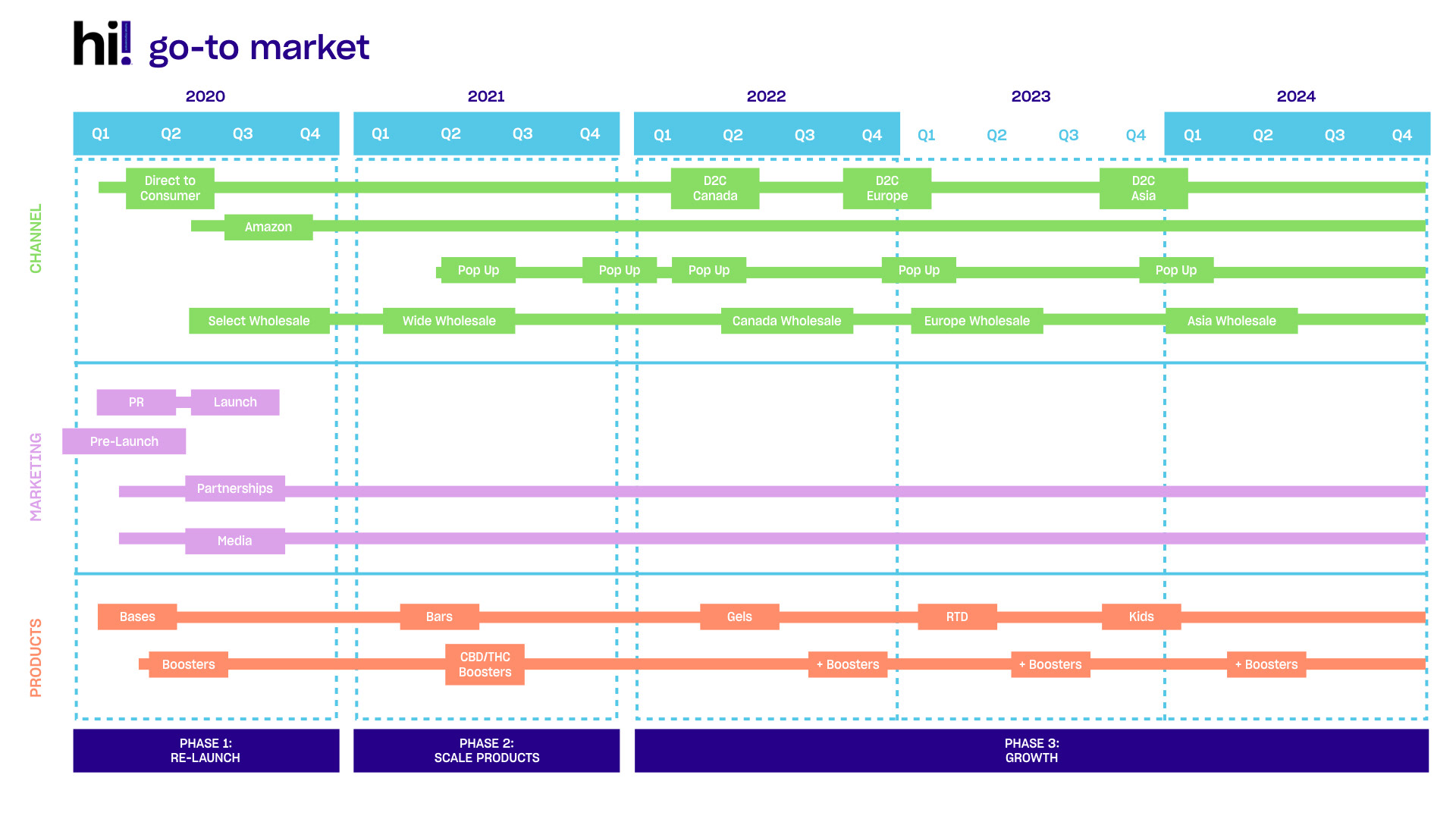
Some favorite slides from a larger product launch financials deck,
turning numbers and ingredient lists into brand-friendly layouts.
turning numbers and ingredient lists into brand-friendly layouts.

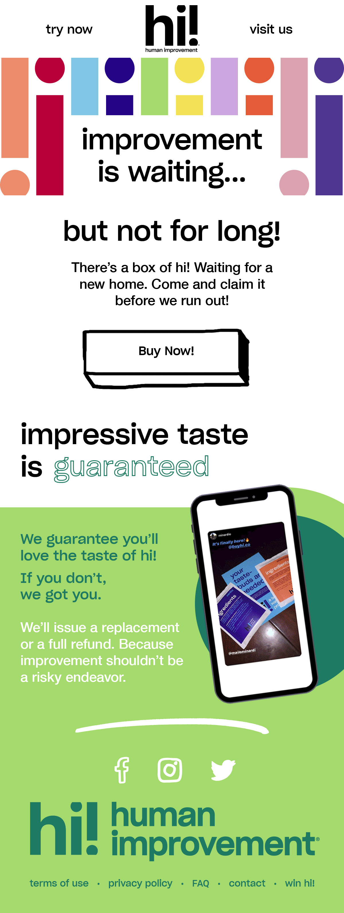
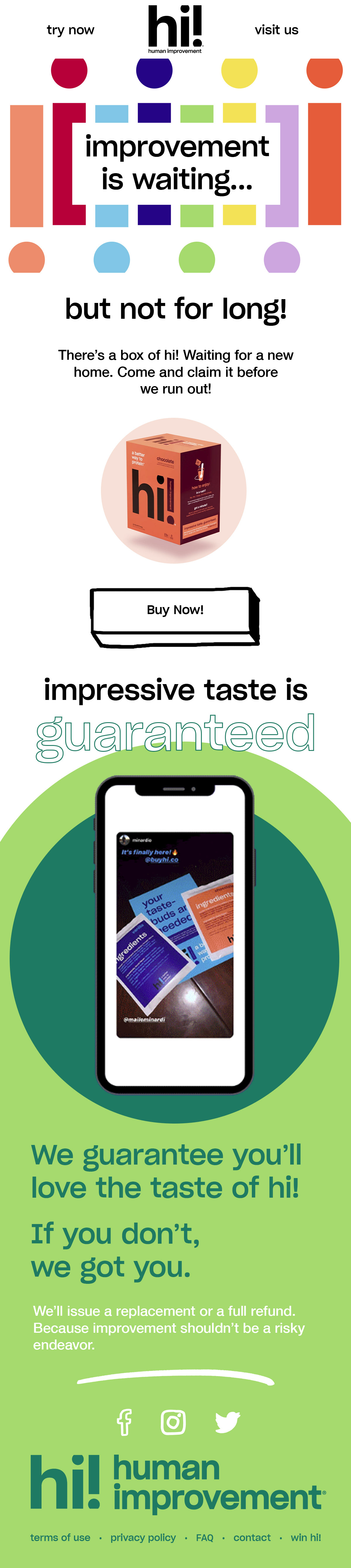
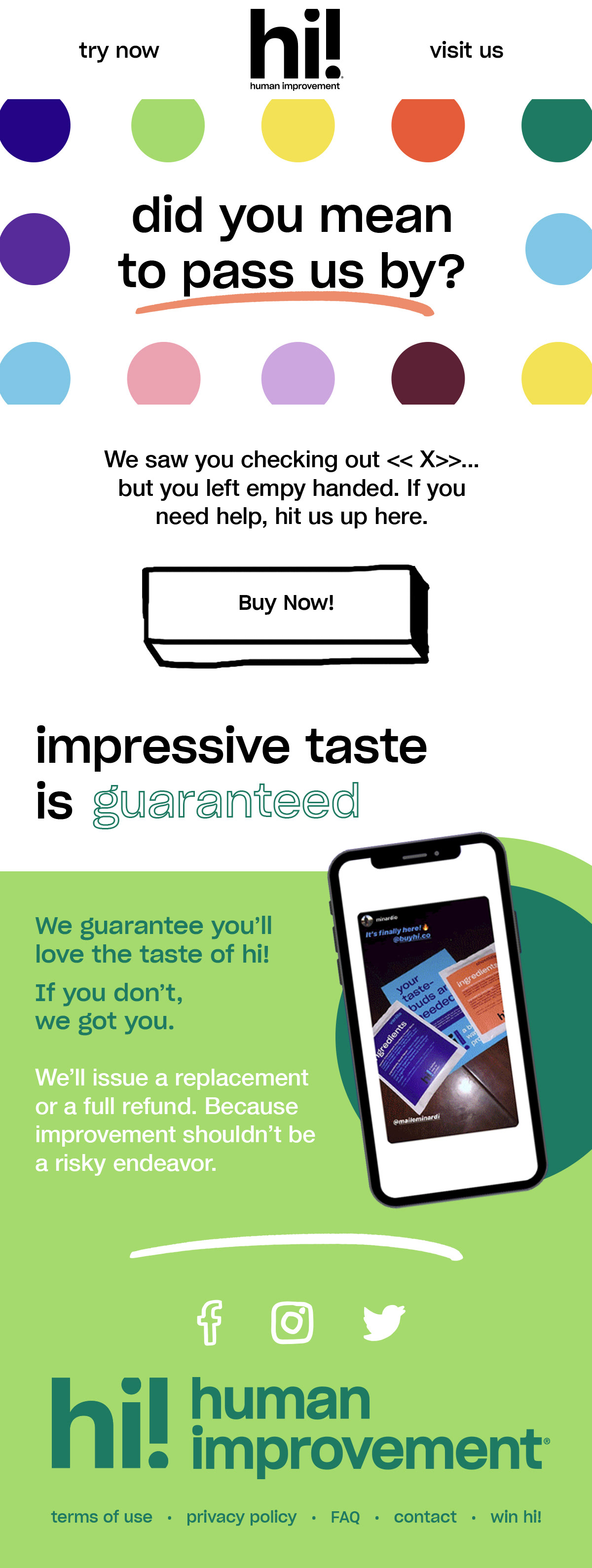
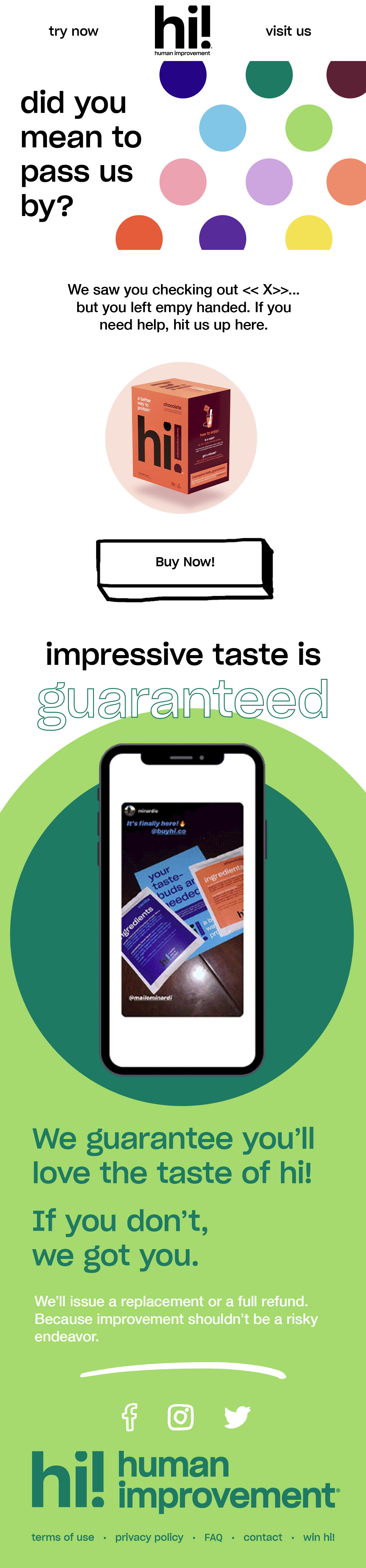
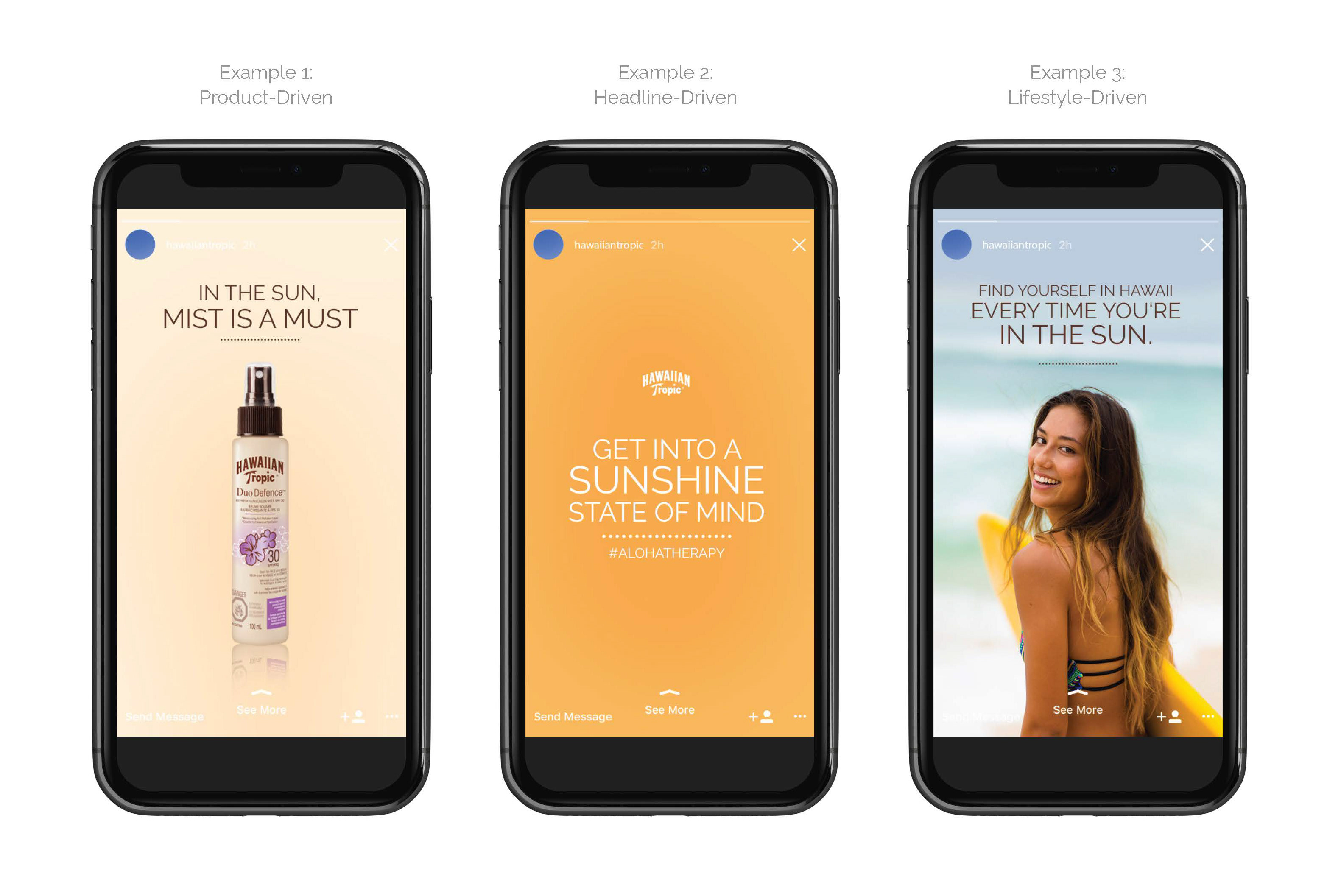
EMAIL TEMPLATE DESIGN
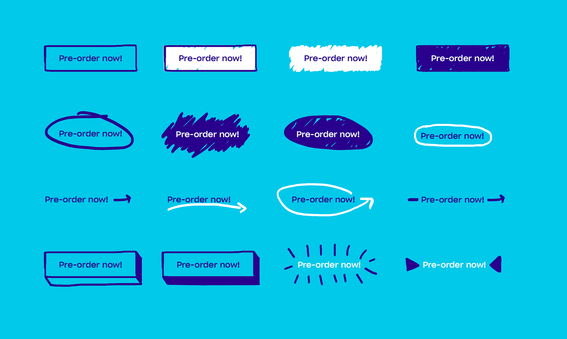
CTA Exploration created by referencing the illustration style featured on the product packaging and existing website design at www.buyhi.co.
Mobile-first email template design series for the pre-order campaign. The brand design uses their primary color combination of "Blue" and "Sky" for both the vanilla packaging and formative brand identity.
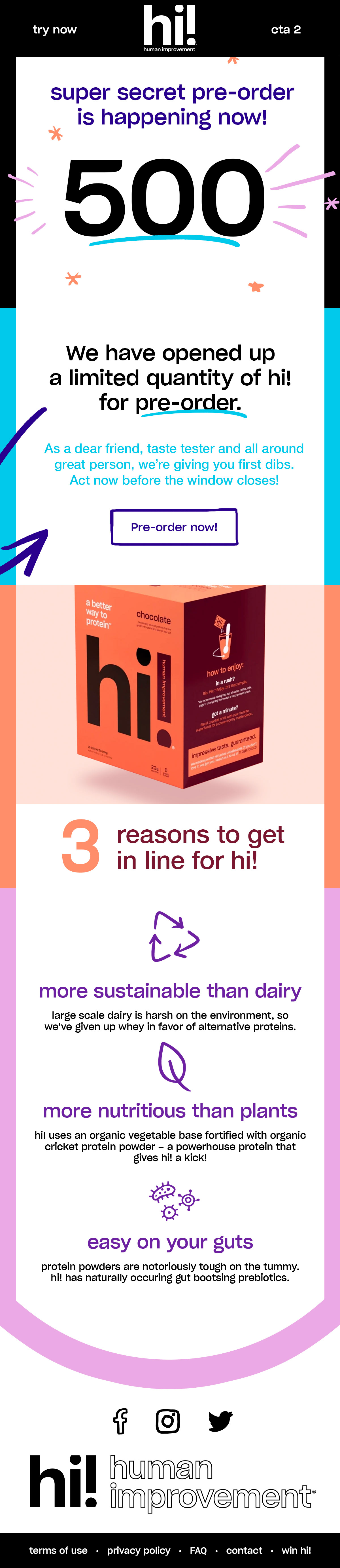
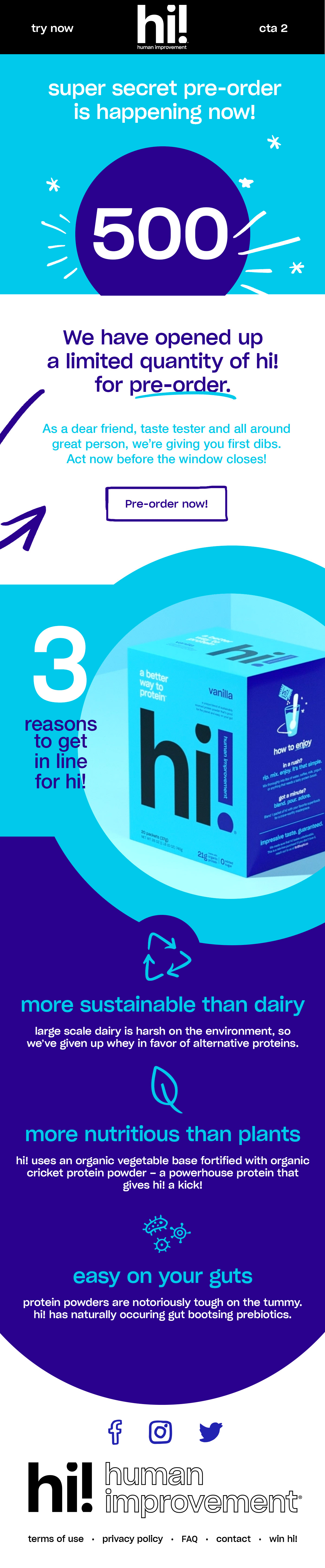
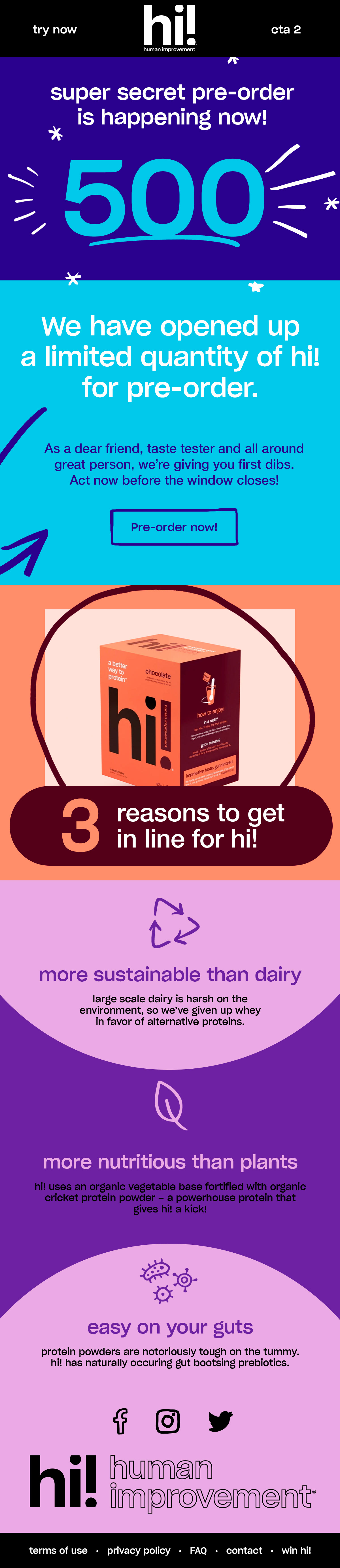
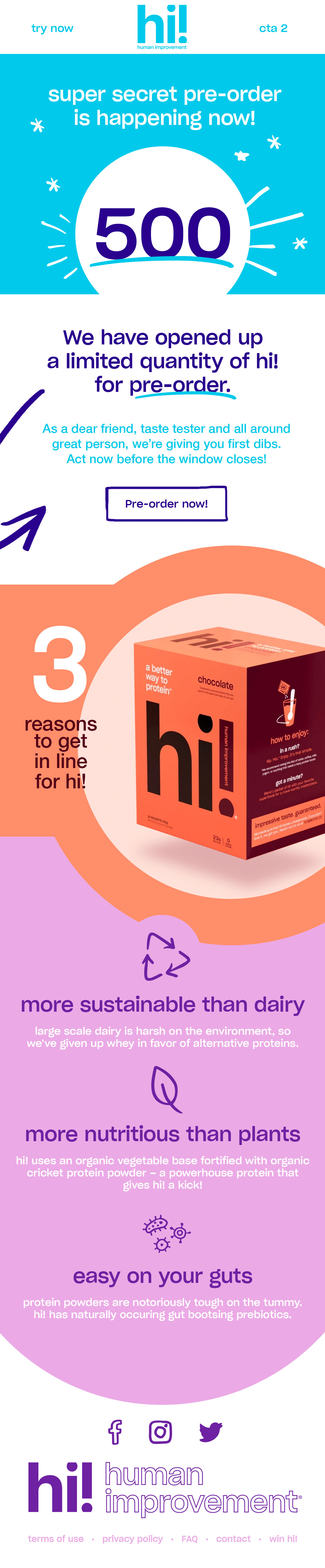
Hi! Protein has designated 12 additional colors for future use in their brand guide. The brand colors will expand via their promotional campaigns as additional flavors are released and marketed in the remaining 6 brand-endorsed color combinations.
I created additional pre-order designs with consideration for image breakpoints in the email design CMS that would allow colorized modules to swap based on email length and the product being targeted or purchased.